
I’ll tell you straight up:
I’m not a designer, and I’ve never been a designer.
But there’s a simple formula I use for whipping together designs that work, and almost anyone can follow it.
It’s pretty cool, and when you use this formula, you’ll have both a web design that looks great and converts well.
Step 1: Find An Awesome, Unique AND Readable Font
What makes a site work?
It needs to look like everything belongs… You don’t want any page element to appear as if it was added in last minute.
(Unless of course you want that element to stick out).
So, the first step in making your site work is this:
Find a nice, unique, and readable font, and use that font for your logo.
Then, use that font for your sidebar headings.
I do that on Social Triggers, and I receive compliments about my design regularly.
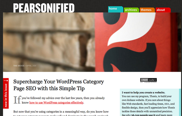
If you’re not looking for that unified of a look, you can do what Pearsonified does.
There, he uses one font for his logo, and another font for his sidebars. And it looks amazing.
Here’s the Pearsonified.com design:
Here’s my Social Triggers design:

But you’ll notice one thing…
Step 2: Choose Font Colors That Work
My site is minimalism at its best, whereas Pearsonified makes great use of colors.
How can you find colors that work well together?
I suggest you check out Colour Lovers. There, you can see color palettes, and then this is how you use them:
- Choose one color for links
- Choose one color for sidebar headings
- Choose one color for “action” (like a buy button, for example, should stand out from the rest of your design).
With my site, I happen to choose black for everything because, well, I like it.
Whereas with Pearsonified, he has his link color, his logo color, and primary colors highlighting each section of his sidebar.
Whatever you decide, the less colors you use, the easier it is to make them work (unless of course you’re a pro like Chris Pearson, heh).
Step 3: Add More Spicy Details (but not too many)
Design is all about the details—especially when those details mesh with your design, and create a unified look.
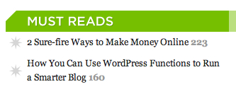
On Pearsonified for example, you’ll notice how he adds a custom bullet icon in his sidebar. It makes that list of links stand out from the rest of his site, so it works.
See it here:
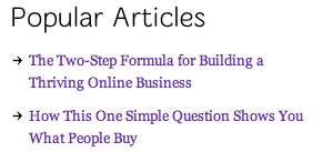
On my site, I use small little arrows, and that works for me because of my focus on minimalism.
See it here:
Step 4: Here’s Where The Conversion Part Comes In…
Follow this simple tutorial, and add email sign-up forms in each of those 4 places.
If you’re not building an email list, you can also ad advertisements in those same places, and they will work well.
And You’re Done
Find nice fonts, choose the right colors, spice your design up… just a little bit… and you’re set.
What do you think?