Seventy-eight years ago, Hedwig von Restorff conducted a memory experiment. Quite simply, she gave people a list of similar, but distinct, items. However, as expected with experiments like this, there was a catch…
One item on the list was a different color from the other items. So, when Hedwig asked her research participants to remember the list, she found that the recall rate of the uniquely colored item was drastically higher than the other items.
It makes sense. When Hedwig changed the color of one item, it stood out from the others and made an imprint in peoples’ minds. Today, we call this the Von Restorff effect, or distinctive encoding, and knowing how to use it is a silver bullet for higher conversions.
How Paras Chopra Increased Free Software Downloads by 60%
A few months ago, I stumbled on interesting test results from Paras Chopra, the founder of Visual Website Optimizer. He was trying to increase the number of people who downloaded his free software, PDFProducer, and here’s what he found:
When he accented the heading of his software download section with a red font color, conversions were 60% over the control, and nearly 20% over the next best result (just a larger font).
And that’s the Von Restorff Effect at work. Yes, a red font helped Paras Chopra’s conversion rates. However, what really made this experiment work was the fact that the red was unique to the download link, and it successfully left an imprint in his audiences’ mind.
When Should You Use Unique Colors On Your Website?
All websites are different, but if I had to make a blanket statement, unique colors work best when you accentuate what people already want.
For example, in Paras Chopra’s case, if they read the copy for the PDF software, they already want to download the software, so using a unique color to highlight the download link helps those people find it.
Where else can you use the Von Restorff effect?
On CrazyEgg.com, when you visit their homepage, you’ll notice that they change the color of their Plans and Pricing button. Yes, a new visitor may not be ready to buy their product, but after reading their sales material, if they were interested, they know exactly where to sign up.

See how Pricing & Signup is yellow instead of green?
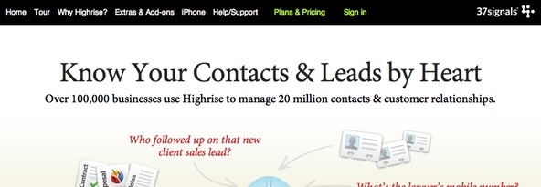
As another example, on Basecamp.com, you’ll notice that they also accentuate their Plans and Pricing page with the Von Restorff effect. See image below:

See the green Plans and Pricing Page?
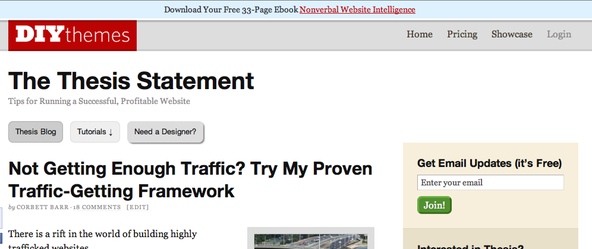
And now, for one final example, let’s look at the DIYthemes blog. At the top, we included a nice blue Hello Bar, which is markedly different from the rest of our site. When we added that, as you read previously, we gathered 1,180 emails in 30 days. Again, the Von Restorff effect at work.

See the blue Hello Bar?
When Should You Avoid Using Unique Colors?
Remember, the best time to highlight specific goals is when you know people will look for whatever you highlight. However, if you accentuate something people never intend on looking for, you’ll hurt conversion rates.
Some people may read this and think, “Perfect. I’ll make my ads stand out and I’ll get more clicks.”
However, that’s not the case. People never look for ads to click on. So, when you call attention to those ads, you actually kill your conversion rates because people realize that it’s an ad.
As another example, here at DIYthemes, I tested a red font for our Pricing link at the top of the page. However, instead of running that red link on all of our pages, I ran it on the blog only.
My reasoning was simple. I thought, “since the blog gets more than 100,000 visits per month, calling attention to the pricing link should increase our conversion rates for sales.”
However, that wasn’t the case. Changing the color of the link to red lowered our conversion rate, and in hindsight, it made sense. Let me explain.
When people visit the blog, they’re looking for information, and that information isn’t always directly related to what we sell at DIYthemes. So, highlighting the pricing link was equivalent to an unwanted ad, thus lowering conversions.
The Bottom Line
Little things, like variations in color, can have a huge impact on your results. Before you start experimenting, make sure you’re using software like Google Analytics to track conversion rates. After all, that’s the only way you can be certain your change worked.
