When you run a website, it’s smart to tweak your design with hopes of improving conversion rates.
After all, how else can you discover small changes that lead to massive results?
The problem is that when you make those design changes, conversion rates don’t tell the whole story.
Well, that’s where the “mouse-click” test comes in.
First, What’s A “Mouse-Click” Test?
Quite simply, it’s a heat map that shows you where people click on your website.
The cool part is that you can see what people click on, even if it’s not clickable.
And that’s the main reason why “mouse-click” tests rock.
You may make a slight change and discover that one of your design elements entices people to click.
But if it’s not clickable, that’s a wasted click.
And a wasted click, is a possible loss of a sale or lead!
How A Mouse-Click Test Revealed A Remarkable Insight On Social Triggers
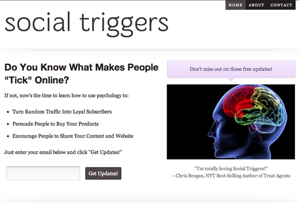
Over at Social Triggers, I redesigned my Feature Box, and here’s what it looks like:

Here’s what I was thinking:
1. Since captions are one of the most well-read pieces of text on a page, I wanted to include the testimonial from Chris Brogan below my image.
2. Since I don’t use much color, I included a purple “comment box” above my image with a small arrow pointing towards the image and testimonial.
Overall, not only did I think these changes looked nicer, I believed that a random visitor would be better persuaded to sign up for my newsletter list.
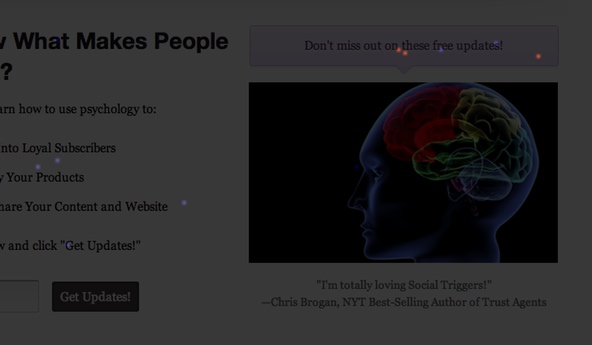
However, that’s when the “mouse-click” test revealed an interesting insight. Take a look at it:

Do you see those red clicks? The ones on the purple box?
Well, if you take a look at the legend, when you see red clicks, that means people are clicking on an item… a lot.
What’s funny is, that’s not even clickable.
The purple box was supposed to grab attention… not attract clicks.
However, after running this “mouse-click” test, I’m now persuaded to make that purple box clickable.
After all, people are clicking on it anyway, might as well see what happens when I make it clickable.
The Bottom Line
When you make changes to your website, some of your design changes may have unintended consequences, and you can use Mouse Click tests to discover what those consequences may be.
Now what do you think?
Have you created any Mouse Click tests?
If not, do you plan to now?
(One note, if you want to know what program I used, I used Click Tale, but you can also use something like Crazy Egg, too.)
