Focus Cards functionality comes in the form of a Thesis Box that can be added to your Focus-powered WordPress website.
Installation and Settings
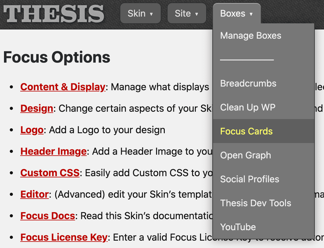
After installing and activating the Focus Cards Box, you’ll need to visit the settings page, which you can access two different ways.
First, from the Boxes menu in your Thesis Admin…
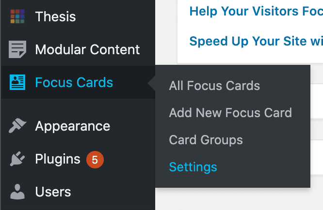
And second, from the Focus Cards → Settings item in the WP Admin menu:
Once you’re on the settings page, you can set the basic options for your Focus Cards, and then you’ll be ready to go!
We’ll walk through each option below.
Important! Even if you don’t change any settings, you still need to click the green Save Focus Cards button one time—this will add the necessary CSS to your stylesheet to support Focus Card output.
Card Style
The Focus Cards Box supports 4 basic display styles, and you can see each of these styles in action below:
- Standard: Simple box shadow
- Soft: Larger box shadow for a softening effect
- Subtle: “Barely there” box shadow
- Flat: No box shadow

The standard Card style includes a modest drop shadow that really makes your Cards pop!

The soft Card style includes a large, spread out drop shadow that lends an air of sophistication to your Cards.

The subtle Card style adds a very small drop shadow that makes your Cards stand out without being obnoxious.

The flat Card style is only suitable if the background color of your Cards differs from the color of your content area.
Card Behavior on Hover
By default, your Cards do not react when a visitor mouses over them.
However, if you’d like to add some kinetics to your presentation, you can select the slightly raised option for an attention-grabbing scaling effect when a visitor interacts with your Cards!
Card Grid Display
You can specify 2, 3, or 4-column grids when you output Card groups, and you can use the following option to determine how Cards behave within your grids:
- Equal heights: Cards in each row display with equal heights
- Natural heights: Cards in each row display with their natural heights
Card Corners and Corner Radius
By default, your Cards will have rounded corners to set them apart from other, more basic display items in Focus.
If you’d like your Cards to have squared-off corners instead, simply select the square option.
Also, you can change the corner radius by selecting a spatial value from Focus that will determine the degree of rounding:
x6— smallestx5* — default valuex4— more roundedx3— very roundedx2— cartoonishly rounded
Interior Card Spacing
This option determines how much whitespace surrounds the text portion of your Cards, which includes the title and the accompanying text that appear beneath the Card image.
To keep spacing proportional with the rest of your design, you must select a spatial value from Focus to determine the amount of whitespace in your Cards:
x2* — one full unit of whitespace (default)x3— moderate whitespacex4— less whitespace
Card Background Color
Use this option if you want your Cards to have a different background color from the content area of your site.
Depending on your color selection, it may also be necessary to select a Card Text Color to ensure your Cards are easy to read.
Card Text Color
If you want to complement your Card background color or if you simply want to make your Cards stand out from the rest of your design, you can use this option to change the Card text color.
Card Title Font
To add some visual distinction to your Cards, you might wish to present your titles in a different font.
Simply select Font 1, Font 2, or Font 31 from the available dropdown, and BOOM—instant font gratification!
Card Title Weight
Your Card titles will display in bold by default, but if you want to use a normal font weight instead, simply select the normal option here.
Important! In order for your Cards to display properly, you need to click the green Save Focus Cards button—even if you haven’t changed any options!
This will add the Card CSS to your stylesheet and ensure everything is perfectly integrated into your Focus environment.
Create, Edit, and Manage Your Cards
Focus Cards are added to your WordPress environment as a custom post type, and this makes it easy to create and manage them the same way you handle Posts and Pages.
In the following video, I’ll show you how to create a Focus Card, and I’ll also explain each of the options on the Card creation screen.
Creating Focus Cards is as easy as creating basic Posts or Pages.
Displaying Your Cards with Shortcodes
Focus Cards functionality includes two shortcodes you can use to display your Cards:
[card]— output a single Card[card_group]— output multiple Cards (with presentation options)
I’ll show you how to use each of these shortcodes in the following video. Beneath the video, you’ll find additional details about the parameters you can use to refine your Card output.
Use the built-in shortcodes to create the perfect presentation!
Card Shortcode
 The basic Card shortcode accepts 3 parameters you can use to affect the resulting output:
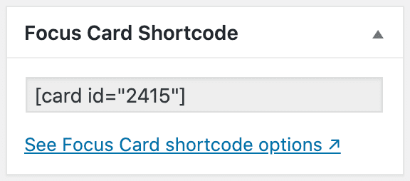
id— (required) the ID of the Card you wish to displayclass— (optional) add an HTML class to the Card outputdepth— (optional) for OCD HTML source indentation
Note: Whenever you use the [card] shortcode, you’ll need to include an id parameter, or else nothing will display!
The other two parameters are optional, though you may find the class parameter useful if you want to apply special CSS styles to a Card in a specific context (like on your home page, for example).
Here’s what that might look like:
[card id="1234" class="card-big"]
This shortcode will output the Card with an ID of 1234, and the resulting HTML will include the card-big class on the Card container.
Card Group Shortcode
The Card Group shortcode is the easiest way to output multiple Cards in a grid. You can use the following 7 parameters to create the presentation you want:
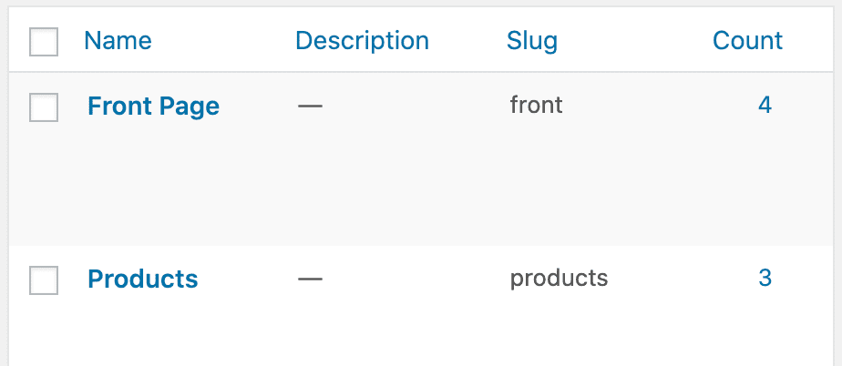
Use the slug value to specify a group!
group— (optional) a group slug name; all Cards in the specified group will be displayedids— (optional) a comma-separated list of Card IDs to display in the specified ordergrid— (optional, only 2-4 are allowed) the number of columns in your gridclass— (optional) add an HTML class to the group containercard_class— (optional) add an HTML class to each individual Cardconstrain— (optional) set to 1 while using a grid to confine output to the content columndepth— (optional) OCD HTML source indentation
Pro tip: While all parameters are optional, the [card_group] shortcode will only produce output if you include either the group or ids parameter.
Card Group Shortcode Examples
// Display all Cards from the 'products' group
[card_group group="products"]

// Display all 'products' in a 3-column grid
[card_group group="products" grid=3]

// Display Card 1234 followed by Card 5678
[card_group ids="1234,5678"]

// Display Card 1234 followed by Card 5678 in a 2-column grid that’s confined to the content column
[card_group ids="1234,5678" grid=2 constrain=1]
Changelog
- 1.3 — March 28, 2024
- Focus Cards List: Now includes shortcode and group info for each Card (saved you a click!)
- Image only: You can now select Cards to output only an image, which opens up new design possibilities/uses for Cards
- Adaptive sizing and spacing: New option to control interior Card spacing in narrow and wide views; Cards will adjust spacing (and title sizing) dynamically for optimal presentation on all screen sizes and Card orientations (bottom line: No need to fiddle with responsive CSS to make your Cards look perfect in all environments)
- WP Admin Toolbar: Removed “View Focus Card” link
- Focus Card CSS: No longer applied unless Focus is the active Skin
- Templates and Queries: Focus Cards no longer appear in the template list (as a child of the Single template) or in Query Box options
- Options Page: Tooltip links all open in a new tab
- 1.2 — January 3, 2021
- Fixed display of entirely-linked Cards when output singularly (ie, not in a grid)
- Explicit CPT declaration to prevent post meta from appearing on any other post type in WordPress
- Now using Box API
post_types()andpost_type_taxonomies()methods to invoke the Focus Cards CPT - Improved spacing beneath Card titles and subtitles
- 1.1 — September 4, 2020
- Major CSS updates for better handling of 2, 3, and 4-column grids in responsive views
- Option to enable Card height-matching in grid displays
- Automatic extension behavior on grid output
- Optional subtitle field added to Card editor
- WordPress 5.5+: Now using the
wp_filter_content_tagsfilter where appropriate - Reorganized options on the settings page
- 1.0 — August 10, 2020