Effectus is packed full of features and optimizations that will enhance your website immediately. Below, you can read about some of the more high-impact features you can use right away.
Mobile-first Responsive Design
Effectus is a mobile-first design which means that it will look amazing and perform well on all devices.

1–3 Column Layout
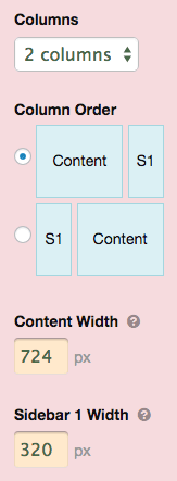
Most Skins and WordPress Themes have 2 column layouts, but we understand that some people prefer a 1 or 3 column layout from time to time. Effectus has you covered here; simply select the number of columns you like within the Design options and BOOM—instant gratification.
You can also control the width of your columns, and in 2 and 3-column layouts, you can even control the order in which the columns appear.
The bottom line? Effectus gives you comprehensive control over your layout structure, so you can create the precise environment that suits your needs.
Fixed or Full Width Layout (and Other Layout Tweaks)
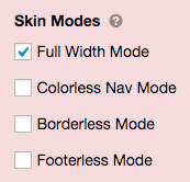
 Do you want your design to span the full width of the browser window, or would you like it to sit in the middle of the screen? Once upon a time, this was a seemingly-simple decision that carried a ton of consequences, but with Effectus, it’s only a click away.
And what about interior layout borders? Removing those by hand can be a real pain, but with Effectus, you simply un-tick a checkbox, and voila!
Want to get rid of the footer? Same deal—one click, and you’re done.
Multi Nav Menu
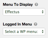
 Effects comes with a built in multi nav option which allows you to select a logged in/logged out menu. This makes it incredibly easy to create different menus for visitors and logged-in users.
All you need to do is create your menus in WordPress, and then specify the appropriate menus in the options shown here.
This is super handy for building any type of membership site with WordPress!
Action Box
The Action Box might be the most exciting feature of Effectus. It’s perfect for encouraging your visitors to take some kind of action, such as an email opt-in or sales lead, and it’s also highly customizable.
You can even include images or video to spice up your presentation, and the simple design options make it easy to get the precise look you want with the Action Box.
Google Font Library…with Optimized Performance
It’s no secret that everybody loves to customize their site with their preferred fonts, but one of the drawbacks of using font libraries is the associated performance decrease.
To combat this, Effectus uses a technique known as asynchronous loading to serve your selected Google Fonts in the most performance-friendly manner possible. In other words, your site will perform better and score higher on critical tests (such as Google PageSpeed) used to determine things like mobile accessibility and even search engine rankings.
Self-cropping WP Featured Images
All WP Featured Images in Effectus are cropped to precise dimensions that match your current layout settings. In addition to Featured Images, your Related Post Images and the Action Box Image are also cropped and optimized according to your layout settings.
If, at some point, you make your site wider, then these images will be re-cropped accordingly to ensure they are the correct size.
Why do this? To ensure maximum performance on all devices at all times. With Effectus, your site will never load images that are larger than they need to be, and this helps keep your loading times as low as possible.
(Can you tell we are obsessed with maximum performance?)
Fluid Videos for Youtube & Vimeo
Has this ever happened to you? You embed a video in your content, only to find it is not responsive and looks strange on mobile devices…
Effectus solves this problem in a maintenance-free way by wrapping your videos in a special fluid-width container that ensures they will scale correctly on any device.
Post Editor Customizations for a Better User Experience
Your WordPress post editor has never been this handy before.
Effectus comes with some additional editor buttons that allow you to add notes, alerts, tips, and code in a simple and intuitive way.
Add drop caps, notes, alerts, tips, or code with these handy buttons.
The post Editor is also styled to more accurately reflect the visual experience on the front end, so you’ll have a very good idea how your posts are going to look before publishing.