This article is deprecated! Any technical information refers to software versions that are now obsolete. Please visit the DIYthemes Blog for current updates, or check out the old Thesis Blog for a treasure trove of website marketing insights.
Everyone wants to be able to tinker with their design to some degree, and I understand just how disappointing it can be to have the desire to change things just to see how they might look on your site. Problem is, if you want to test out different fonts, text sizes, or layouts, you have to know a lot of technical crap to be able to pull it off.
At least, that was the case before Thesis 1.1 hit the streets. With the new Design Options panel, you now have the ability to change fonts and font sizes all over the theme, and even more important, you can opt for a 1, 2, or 3-column layout!
And just because I think you should have icing with that cake, you can also modify the widths of the content and sidebar columns. Have you been using 500px-wide images on your site for ages? No problem—just choose a 500px-wide content area. Maybe you want 540px instead? You get the idea.
The bottom line is that your theme should work for you, not the other way around. Thesis gives you the flexibility and control you need to have if you want to run your site your way. Best of all, it’s drop-dead-easy to use the new features in Thesis 1.1, so without further ado, let’s take a closer look at them!
Layout Constructor
The biggest change in version 1.1 is the new layout constructor, which gives you an unprecedented level of control over your site’s design. Using this tool, you can control the type of layout that your site uses (1, 2, or 3-column) as well as the widths of the columns in the resulting layout.
For comprehensive details on the layout constructor, check out the following page from the Thesis User’s Guide:
- How to build a 1, 2, or 3-column layout using the Thesis layout constructor [edit: link removed]
Font and Font Size Controls
Testing different font and size combinations has never been this easy. With Thesis 1.1, you can control the fonts all over the theme from within the options panel, and best of all, you can rest assured that the resulting output will be typographically accurate, regardless of the font/size combination you choose!
Don’t like Georgia, the default Thesis font? No problem—you can change it in seconds with the new font controls. Thesis 1.1 gives you the editorial design control you need, so you’re not stuck with something that you don’t like or don’t know how to change. For more info on the killer new font controls, cruise on over to the appropriate page in the user’s guide:
- How to Change Fonts and Font Size [edit: link removed]
New Title Tag Constructor
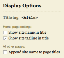
Title tag constructor in the Thesis Options panel
With the new <title> tag constructor, you can control the structure of the <title> tags on the various pages of your site. Prior versions of Thesis did not give you any control over this crucial element, but in version 1.1, you’ve got quite a few options for this important part of your SEO campaign.
Although the title tag constructor is pretty easy to use, I still recommend checking out the user’s guide to learn more about how to set up your title tags.
New and Improved Post and Page-specific CSS Classes
Although Thesis 1.0 featured page-specific CSS classes, the implementation left a lot to be desired. For starters, only pages received these classes (posts did not), and to make matters worse, the classes were not added to the <body> tag, which would have allowed for completely unique page customizations.
In Thesis 1.1, these classes have been moved to the <body> tag, and even better, you can now choose your own custom class names by using the new slug custom field, as demonstrated in the figure below.

The new slug custom field key allows you to create your own custom class names on posts and pages.
On pages, a custom class name is automatically generated from that page’s permalink, but you can override this by utilizing the slug custom field as shown above. Posts, on the other hand, do not receive a custom class name by default, but if you like, you can add one by using the slug custom field in the same manner.
Cool? I thought so.
Nav Menu Changes
In prior versions of Thesis, the nav menu contained two things that I really disliked and decided to change:
- First, from a user interface perspective, the nav links were sub-optimal because you had to click on the word itself (inside the tab) in order to activate the link. Having the entire tab serve as the active link area is a much better interface solution, and this is another improvement you’ll find in Thesis 1.1.
- Second, the line separating the nav menu from the header area was formerly a background image served via CSS. If you ever attempted to customize the colors of the nav menu, then you probably realized what an annoying roadblock this was (and you probably cursed me as well!). In Thesis 1.1, the gray border is now a simple CSS property that belongs to the nav menu, and as a result, customizing your nav menu colors should prove a little less frustrating in the future.
New Supported Image Aspect Ratios in the Multimedia Box
The multimedia box is a little smarter than it was in previous versions of the theme, primarily because it now recognizes eight standard image aspect ratios, including:
- 4×3
- 3×4
- 3×2
- 2×3
- 5×4
- 4×5
- 16×9
- 9×16
Make sure that the images you upload to your /rotator folder match one of the above aspect ratios. As long as you cover this base, Thesis will output (and randomize) your images perfectly, no matter which layout you’ve selected from the awesome new layout constructor!
Updates to the User’s Guide
If you haven’t checked out the Thesis User’s Guide in a while, now is a great time to do just that. We’ve added quite a few new pages, and hopefully, you’ll be able to use the guide to pimp your theme to the max!