After installing and activating the Pearsonified Skin, you’ll need to set up a few items before you’re ready to rock. To begin, log into your WP admin and visit the Thesis Skin Content page (Thesis Admin → Skin → Content), and then locate the Pearsonified Skin Content links.
Navigation Menu
Locate and then click the Nav Menu link, and on the ensuing page, you’ll be able to specify a WordPress navigation menu to use in your Skin.
Please note that if you have not yet created a menu, links to your WordPress pages will show by default. Generally, this results in an ugly menu, so we recommend creating one now by visiting Appearance → Menus in your WordPress dashboard.
Header Image
Without question, the most striking design feature of the Pearsonified Skin is the big header image at the top of the page.
To specify your own header image, visit Thesis Home → Skin → Header Image, and upload a .jpg or .png image or choose an existing image from your WordPress Media Gallery.
Logo
In addition to a header image, you can also supply an optional logo by visiting Thesis Home → Skin → Logo.
On this page, you can upload a new logo image, or you can choose an existing image from your WordPress Media Gallery to serve as your logo.
You can use any size image you want here, but please note that wide logo images (>500px) may interfere with the navigation menu in mobile device views. Because of this, it’s a good idea to test your site on a few different devices after adding a logo.
Pro tip: For best results, we recommend using a .png image with a transparent background.
Pearsonified Featured Item
No matter whether or not you specify a header image, the Pearsonified Skin enables you to specify a featured image or video that will appear at the top of any post or page.
To set a featured item on any post or page, visit the WordPress post editor, and look for the Pearsonified Skin Featured Item box beneath the post content.
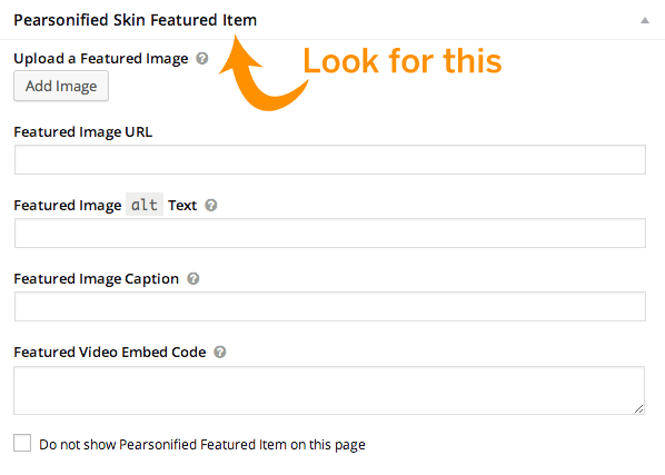
Using the available options, you can select an image from your WordPress Media Gallery, specify an image URL directly, or even paste video embed code that will result in a big, beautiful video at the top of your page.
Super sweet! If you’ve provided a caption for an image, the Pearsonified Skin will include it in a cool overlay on top of your image.
Simple, Powerful Design Customizations
The Pearsonified Skin gives you point-and-click control over the design elements you’re most likely to want to change—fonts, colors, and the width of your content and sidebar columns. To access these design options, visit Thesis Admin → Skin → Design.
Let’s take a quick look at some highlights from the design options:
Google Fonts
Thanks to the Skin’s Google Fonts integration, the font selectors give you access to Google Fonts that have been hand-picked as suitable for displaying primary content.
Color Scheme
The Pearsonified Skin color scheme selector operates in two modes: Complementary and direct selection. By default, the color scheme runs in complementary mode.
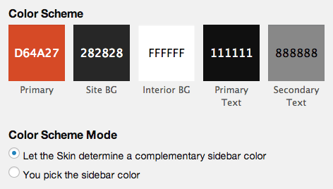
When you select a primary color (the first swatch on the left) while running in complementary mode, Pearsonified uses this color to determine many of the other colors used in your design. For example, links, buttons, your nav menu, and even your sidebar headings are all based on your primary color.
If, instead, you’d prefer to select your own secondary color (which mainly determines the color of your sidebar headings and associated highlights), you can change the Color Scheme Mode to direct selection (“You pick the sidebar color”). This will give you access to a sidebar color swatch.
Advanced Design Customizations
All Thesis Skins come with a Custom CSS Editor, and the Pearsonified Skin is no exception. If you wish to make design customizations that cannot be accomplished from the Design options page, then you should visit the Custom CSS Editor (Thesis Admin → Skin → Custom CSS) and place your custom styles there.
Design customizations are not part of official support. We provide members-only community forums as a service to you, so you can reach out to other Thesis users and get the help you need.
Skin Content Control
Want to display author avatars on your posts? How about categories or tags?
Using the Pearsonified Skin Display Options, you can quickly and easily control the display of some of the items in your Skin. These options are located atop the Skin Content page, which you can access by visiting Thesis Admin → Skin → Content.
If you find yourself asking, “How do I show [x]?” or, “How do I get rid of [x]?”, then you’ll want to look at the Display Options to see if there’s an easy way to achieve your goal.
Custom Templates, Including Landing Pages
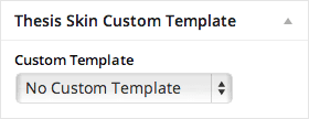 The Pearsonified Skin comes with 4 custom templates that give you maximum flexibility and control over the way your pages appear. To set a custom template on any post or page, look for the Thesis Skin Custom Template section in the right-hand column of your post editor.
First, by using the centered landing page template, you can eliminate visual noise and distracting links, thereby encouraging visitors to focus exclusively on your content. This is great for sales pages, sign-up pages, or any other scenario where you need visitors to focus on a call-to-action.
Second, the full landing page template is similar, except it gives you a huge column of text that takes up the entire page. If you produce infographics, big pictures, or just need lots of space, this template is perfect for helping you get the job done quickly.
Third, the full post and full page templates are similar to the full landing page template, except they include typical links (like your navigation menu) and are not centered. Comments are included in these templates, too, so if you’re looking for audience interaction (as opposed to conversions), these custom templates are a great choice.
Usage note: If you set a custom template on a post or page, that selection is made relative to the active Skin. If you switch your Skin in the future, any posts or pages that were running a custom template under the previous Skin will revert to default templates in the new Skin.
Widget Areas
Out of the box, the Pearsonified Skin comes with 5 widget areas where you can place custom widget content like email signup forms, links, search boxes, ads, and more.
The default widget areas available to you are: Sidebar, After Post, After Page, After Front Page, and Footer. The first four are pre-styled to accommodate anything you might want to include in them; the fifth widget area, Footer, is included as a convenience but does not have any default styling associated with it.
Pro tip: If you’re just getting started with the Pearsonified Skin, we recommend working with the Sidebar widget area, and then you can branch out from there as needed.
New “box” Class for Content Formatting
All Thesis Skins ship with default styles for note and alert boxes in your primary text.
Naturally, the Pearsonified Skin includes note and alert styling, but it also includes a new class, box, that you can use in either the content or sidebar to draw attention to something important.
Simply add a box class to any block-level HTML element in your content or sidebar, and it’ll appear with a background highlight based on your primary layout color.
Using the box class is a great way to get your visitors to focus on a particular item, such as an email signup or other call-to-action.
Email Signup Forms
The Pearsonified Skin includes default styling for email signup forms placed in either the content or the sidebar.
Whether you place the email signup form via Box, widget, or custom PHP is up to you; no matter how you include your email signup form, this Skin is ready to make it look gorgeous, even in responsive views.
Looking for More?
Head on back to the main Pearsonified Skin documentation and see if you can find what you need.