This document is deprecated! The information on this page refers to a Thesis version that is now obsolete. Please visit the Thesis Docs for current documentation.
Adding a series of social media icons to the default WordPress navigation menu is a simple process, though it’ll take plenty of words to describe — but when we’re done, you’ll go from “blah” to “hurrah” — like this:

Many of the basic concepts we’ll use are also covered in the “Adding Social Media Icons” User Guide tutorial, which presents a broad overview of how Thesis users can link images in WordPress to various social media sites — or other locations.
But this time, we’re going specific with sprites for the navigation menu.
Why add clickable images or icons to the WordPress nav menu at all?
First, because it’s popular, and as a common practice, your visitors might expect — and certainly won’t be surprised — to see these social media images in the navigational area, especially when they’re floated right.
Second, it’s very easy to set-up, works well across browsers — and there are tons of high quality, free icon sets out there.
Third, the navigation menu is a priority “heat map” area for visitors — if the goal of your site is to gain followers, shares, likes, Google+ clicks, and so on, the WP nav menu is a solid choice for positioning such calls to action.
Making a Nav-Ready Image Sprite
First things first, you need images for your social icons. You could use a “one image, one link” relationship — or even two images per link, one for default, one for hover — but this creates additional calls to the server host.
That’s where a sprite delivers the goods. No flickering on hover, no preloading scripts, and, once created, a single image to handle your entire social media nav area. Your image sprite might look like this:
![]()
Or your social media sprite could look like this:
![]()
![]()
And of course, the options are infinite.
The basic concept of an image sprite is to place what would usually be considered multiple images onto a single canvas — and then show only pieces of that canvas at any given time and position.
Instead of eight images, or four “normal and hover” state sprites, a single image can do everything you need in order to link-out to social media sites like Twitter, Google+, Facebook — and we’ll add a link to your RSS feed subscription, too.
Let’s find out how to add this easily to a WordPress nav menu, where we’ll use the smaller-sized image sprite above for this particular tutorial.
Creating and Preparing the WordPress Menu
You’ve decided on your images, and have combined them into a single image sprite — or if not, for purposes of following along, you can save the smaller sprite above to your desktop, upload it to your host with FTP or cPanel, and use it for initial testing and learning.
With an image, now we need to build the WordPress menu components that call the sprite out in “one at a time” pieces of imagery.
For those using the default Thesis navigation menu — with the “Subscribe” link and small RSS icon active — note that this will not carry-over to the WP nav menu. But we’re going to add an even sexier RSS icon back as part of this tutorial — it’s all good!
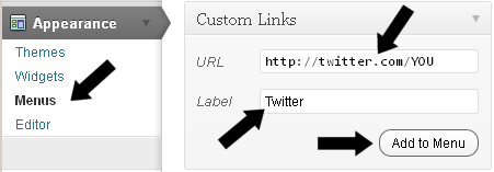
If you’re already using a WordPress menu, adding links to “other places” is easy. Go to your WordPress dashboard, then click Appearance, and finally, click Menus.
You should now see your existing WP nav menu. Add “Custom Links” for each of your desired social media icons. The “URL” field will be the link destination, so, for example, you might add http://twitter.com/YOU where you’ll replace YOU with your Twitter user name.

Keep the “Label” of your custom links short and descriptive, because this text will soon be replaced by your sprite image. Leaving “Label” entirely blank is best — or would be — but a blank Label can be confusing from an organizational standpoint.
WordPress nav menus designate blank-label “Custom Link” additions as a “Menu Item” when they are saved to the menu. Since you’re adding several links, a short Label helps identify your new links in the WP dashboard. If you do add them, keep your label brief — search engines frown on hidden text.
When you’ve created a URL and Label (if any) for each Custom Link, click “Add to Menu” and move on to the next Custom Link until you have created all that you need.
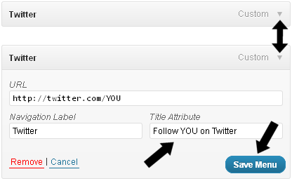
Now you have one or more Custom Links, each with a URL pointing to a social media destination, and with a brief Label such as “FB” or “Twitter” to help you tell them apart. While optional, it’s recommended you take a moment to populate the “Title Attribute” for each.
To access the “Title Attribute” field, expand the menu item in the saved menu panel as shown below.

The “Title Attribute” will be visible in most browsers as a hover-state text “tool tip” — a brief description or additional call to action. This is worth adding to each new link. For example, a title such as “Follow Me on Twitter” would be typical. Make the necessary changes to the title for each “Custom Link” you’ve added, and save the menu.
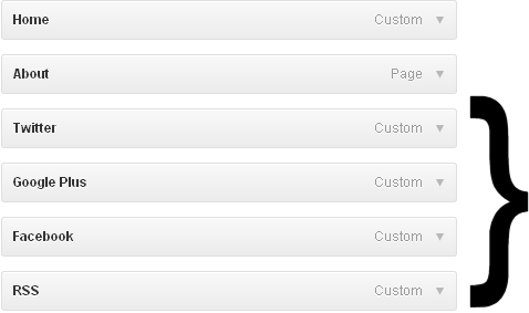
In the condensed form, and pretending you have the existing menu items “Home” and “About” — your Primary Menu will appear something like this in the WP Menus section:

Identifying the Unique Menu Selectors
You have an image sprite to use and a set of temporary “visible text” links in your WordPress nav menu. Now it’s time to identify the selectors needed for the CSS work.
The area of primary interest is your nav menu — from the visitor website perspective. This should appear much like this, where the red outline emphasizes the new links you’ve added:
![]()
Simplifying in places, the selectors you need will look roughly like this in view source, or — so much easier! — quality tools like Firebug (a free Firefox add-on) or the Google Chrome right-click inspector:
<li class="ignore-this" id="menu-item-200"><a href="">Twitter</a></li>.
All you’ll need is the ID of the list item, as associated with the destination link in question. In other words, you’d need “menu-item-200” and “Twitter” from the example above. Your ID numbers will vary, but will be sequential if you added all the new links to your WP menu at the same time.
Note each of your new nav menu links with their id=”” selectors, either by writing them down on paper, or by saving them in a simple text editor temporarily. You’re almost there!
With everything else prepared, we finally get to play with the CSS magic!
Replace the AAA, BBB, CCC, and DDD placeholders below with the unique numerical identifiers obtained in the previous step above — one of them would be “200” going from the prior example. Again, your identifiers will be different, but the basic look of the HTML will be similar.
The below CSS assumes you have uploaded the sprite image file — using FTP or cPanel — to your Thesis /custom/images folder, and that the file is named “my-nav-sprite.png” — you can change the image sprite’s file name, but if so, change it in the code below accordingly.
Add this to your custom.css file contents:
.custom #menu-item-AAA a {
display:block; height:24px; width:24px; padding:0px; margin-left:6px; outline:none; text-indent:-9999px;
background-image:url('images/my-nav-sprite.png'); background-position:0 0;
}
	.custom #menu-item-AAA a:hover { background-position:0 -24px; }

.custom #menu-item-BBB a {
display:block; height:24px; width:24px; padding:0px; margin-left:6px; outline:none; text-indent:-9999px;
background-image:url('images/my-nav-sprite.png'); background-position:-24px 0;
}

	.custom #menu-item-BBB a:hover { background-position:-24px -24px; }

.custom #menu-item-CCC a {
display:block; height:24px; width:24px; padding:0px; margin-left:6px; outline:none; text-indent:-9999px;
background-image:url('images/my-nav-sprite.png'); background-position:-48px 0;
}

	.custom #menu-item-CCC a:hover { background-position:-48px -24px; }

.custom #menu-item-DDD a {
display:block; height:24px; width:24px; padding:0px; margin-left:6px; outline:none; text-indent:-9999px;
background-image:url('images/my-nav-sprite.png'); background-position:-72px 0;
}

	.custom #menu-item-DDD a:hover { background-position:-72px -24px; }
If you used the sprite file from earlier as your image, then your nav menu should now look like this:
![]()
This CSS code — for each of your four custom links — defines the width and height, adds a margin for spacing between the images, and calls the background image files — all of which are the same file, because we’re using a sprite.
The brief snippets of visible text — looking back, the “Label” in the WP nav menu screens (adding Labels was optional) — will be pushed out of sight with an indent value; only the image remains.
The background position is key, as this determines the “normal” and “hover state” positioning for each of your links. In this example, there are four images visible, but each of these four “images” — actually, parts of a larger image, a sprite — will shift position on “hover” to an alternate version, providing end-user feedback. In this example, the feedback is a change to a gray-scale edition of the original linked image.
If you prefer your social media links and images to appear on the far right of your menu, a common practice, simply add this to your custom.css file contents:
.custom #menu-item-AAA,
.custom #menu-item-BBB,
.custom #menu-item-CCC,
.custom #menu-item-DDD { float:right; }
Remember to change the AAA (etc) values to your identified selectors.
While condensed here for reasons of space, your nav menu with a right float will appear more like this:
![]()
Looks nice, wouldn’t you agree?
This was quite the journey — but the basic steps are simple and logical in retrospect…
We expanded on a typical WordPress navigation menu, added new custom links to that menu, identified the unique numerical designations for each of the links we created, and then applied CSS code to those links. Finally, we replaced the brief anchor link text with an image — a sprite we “moved around” using the background-position property.
Considering you can now create an image sprite for any link to any destination, the knowledge gain is well worth the time investment.
Enjoy your new social media — or anything else — image links in your WordPress menu!