 With the new Pearsonified Skin for Thesis, you will…
Look smashing from every angle thanks to a finely-tuned responsive design.
Enjoy a big header image and a stunning way to present your videos.
Craft a feel that’s uniquely you with eye-popping color scheme functionality and one of 100+ Google Fonts available right out of the box.
Get ready to grow with custom templates for every occasion, including high-converting landing page templates.
Above all else, you’re gonna have fun with this sophisticated, savvy Skin from your detail-obsessed friends at DIYthemes.
Let’s take a closer look at why the Pearsonified Skin is so sought-after and—more important—how you can use it to rock your web design world.
Big Images, Big Videos, Big Impact
The Pearsonified Skin makes it easy to add a big header image to your site, but that’s only the beginning.
If you really want to spice up your posts or pages, you can add a featured image or video that will appear in the header image space at the top of the page.
Check out the images below to see how dynamic and awesome your pages can be when you use a featured image or video:
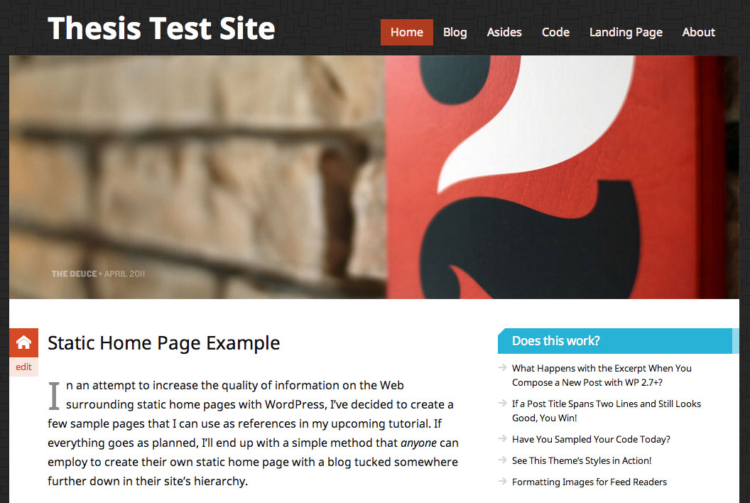
Figure 1. The top of a typical page using the Pearsonified Skin with a header image.
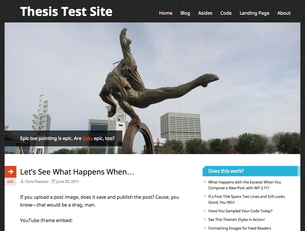
Figure 2. The top of a page using the Pearsonified Skin with a featured image and caption.
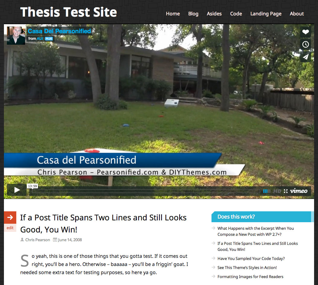
Figure 3. The top of a page using the Pearsonified Skin with a featured video.
Adding a featured image or video to your pages is easy, too. On the post editing screen, just look for the Pearsonified Skin Featured Item box, and then select an image or paste your video embed code.
Boom—your page just got sexier.
Brilliant New Color Scheme Selection
Changing your layout colors is easy—and fascinating—with the color scheme controls included in the Pearsonified Skin design options.
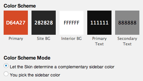
The first color swatch, which determines the primary color of your design, is where the magic happens. When you select a color here, Pearsonified uses that color to determine many of the other colors used in your layout.
Sidebar headings, for example, are presented in the best complement to your primary color. This takes the guesswork out of design and ensures your colors will always work well together.
Other elements like text highlights, buttons, and even your navigation menu are also based on your primary input color; the Pearsonified Skin handles all of this behind the scenes.
The end result is a simple system where you select a color, and the Skin outputs a beautifully coordinated color scheme based on your selection.
Ultimately, the color scheme possibilities here are limitless, so I know you’ll have a fun time playing with colors and seeing what works best for you.
(In case you’re curious, Pearsonified uses the HSL color space and some basic math to determine complementary colors and to create your color schemes.)
Integrated Google Fonts
The Pearsonified Skin comes with an amazing Google Fonts integration that gives you out-of-the-box access to 69 unique fonts.
Editor’s note: Our Skins now provide immediate access to 100+ Google Fonts and an easy way to add anything else you want from the entire Google Fonts library.
Although Google offers hundreds of fonts, only a select few of these contain the styles necessary to make them suitable for use in your content. Pearsonified creator Chris Pearson combed through every Google font and hand-picked the ones that are optimized for use in your content, so you can be confident the one you choose will look stunning.
Together with the color scheme controls, these Google Fonts will make it easy to create a unique look and feel for your site.
[Your Logo Here]
Want to use a logo image instead of text for your site title?
With the Pearsonified Skin, you can choose an image from your WordPress Media Gallery to serve as your logo, or you can upload a new one. Either way, it’s easy, and your logo will look great on mobile devices, too.
Display Options to Fit Your Needs Precisely
Want to display author avatars on your posts? How about categories or tags?
Using the Pearsonified Skin Display Options, you can quickly and easily control the display of certain items in your Skin. These options are located atop the Skin Content page, which you can access by visiting Thesis Admin → Skin → Content.
If you find yourself asking, “How do I show [x]?” or, “How do I get rid of [x]?”, then you’ll want to look at the Display Options to see if there’s a one-click-easy way of achieving your goal.
Custom Templates for Every Occasion
In addition to standard WordPress templates, the Pearsonified Skin comes with 4 custom templates that give you maximum flexibility and control over the way your pages appear.
First, by using the centered landing page template, you can eliminate visual noise and distracting links, thereby encouraging visitors to focus exclusively on your content. This is great for sales pages, sign-up pages, or any other scenario where you need visitors to focus on a specific call-to-action.
Second, the full landing page template is similar, except it gives you a huge column of text that takes up the entire page. If you produce infographics, big pictures, or just need lots of space, this template is perfect for helping you get the job done quickly.
Third, the full post and full page templates are similar to the full landing page template, except they include typical links (like your navigation menu) and are not centered. Comments are included in these templates, too, so if you’re looking for audience interaction (as opposed to conversions), these custom templates are a great choice.
Stunning Text Formatting Styles
Thesis Skins have always been associated with the finest typography on the Internet, and the Pearsonified Skin is taking this to a new level with the addition of some high-impact formatting styles.
With this Skin, you’ll have access to fancy pullquotes, a brand new box styling class, and even footnotes for your articles!
Check out the text formatting page on the demo site [edit: link removed], and you’ll be able to see all of these new styles in action.
Widget Areas for You to Customize
Upon installing the Pearsonified Skin, you’ll have 5 built-in widget areas where you can place custom content like email signup forms, links, ads, search boxes, and more.
You’ll find these widget areas in the most desirable locations: Sidebar, after post, after page, after front page, and even in your footer.
A Word About the Responsive Design
Naturally, the Pearsonified Skin features a responsive design, but all responsive designs are not created equal.
This Skin actually has a mobile-first responsive design, which means something slightly different depending on who you are.
If you’re a designer or developer, this means that the responsive CSS is organized using min-width media queries. In other words, the design’s “base” includes only mobile styles, and then styles for larger viewports are added on using min-width declarations that are based on the design’s dimensions.
This approach actually makes the stylesheet smaller (by about 1.5kb) and also results in enhanced organization. Better organization means easier and more straightforward customizations over time, so from that standpoint, this is a big deal.
(For the record, this is the first time I’ve used a mobile-first stylesheet, and I have to say, I really like the approach. Customizations feel more natural to me, and it’s just easier to tell which styles will apply to which viewports.)
If you’re a typical user (read: not a designer or developer), then a mobile-first design simply means that your site is guaranteed to be optimized—and fast—on mobile devices, iPads, tablets, and everything else with a screen and a power button.
Everything Old Is New Again
I thought this information was fun, so I figured I’d share it with you here:
The original Pearsonified design, which has been running on my personal site for about 100 years now, has a CSS file that weighs in at a somewhat-bulky 38kb. In addition, the original design is not responsive, and it only supports a single custom template style.
The new Pearsonified Skin for Thesis is not only responsive and insanely detailed, but it also includes styles for 4 custom templates, email signup forms, widgets, incredible font and color options, and more.
And the best part?
The new CSS file weighs in at a svelte 28kb, which means your site will be just as fast as it is beautiful.
Thesis provides designers and developers with many optimization and performance advantages, and the Pearsonified Skin CSS file is just one example of how these enhancements can affect your site positively.
Detailed Documentation
To help you hit the ground running with the Pearsonified Skin, we’ve created documentation that will walk you through initial setup as well as the major features.
You can find the Pearsonified Skin documentation in the Thesis User’s Guide.
