You ever wonder why people use frames on some images and not on others?
Is this a design preference, or is there something else going on that you don’t know about?
Here on the Thesis blog, we use frames in a specific manner for a specific reason.
It sounds silly, I know, but trust me. When you see why and when we use frames, it will all make sense.
When—and Why—We Use Frames On Our Images
Years ago, I was like you. I used frames when and where I wanted, and there was no rhyme or reason for when I used them.
However, after talking with Chris Pearson, the creator of Thesis, he showed me exactly when to use frames, and why.
Before I jump into the why, here’s the when:
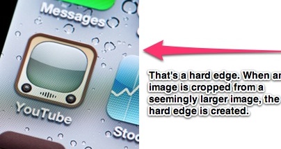
You should use frames when you have an image that’s either cropped with a hard edge, or an image where the color extends to the end of the image.
Or, for example, you’d use a frame on an image like this:

See how the image would extend if it wasn’t cropped? That’s the perfect time to use a frame.
Also, the color in the image itself extends towards the edge of the image, so even if it was a photograph, the same rule would still apply.
However, when you have an image that’s without a hard edge—an image that’s seemingly floating on a white background—you shouldn’t use a frame.

See how you have the complete image? No need for a frame.
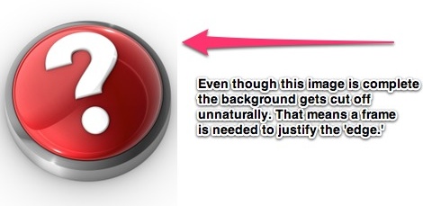
But here’s where things get tricky:

See how the question mark button is clearly complete?
In this case, a frame is still needed. The background surrounding that object appears as if it can continue on past the cropped part of the image.
Why Do We Use Frames Like This?
Here’s the deal:
It just makes sense aesthetically.
While I haven’t tested whether this affects conversion rates, when you have an image that’s cropped, you need a reason for the image ending abruptly, and a frame provides this.
It’s almost like you’re hanging a picture on your blog post.
However, when the image is complete, and it doesn’t appear as if it was cropped from a larger image, you can simply let the image ‘live’ on the background of your post, almost like it was wallpaper instead of a picture frame.
