After reading about Flex below, be sure to check out everything that’s new in the Flex 1.1 update!
 For years, we’ve been providing you with the best-performing designs in the business. From SEO to speed, we’ve focused on the details and given you Skins that look just as good on the inside as they do on the outside.
But now that we’ve nailed the fundamentals and can guarantee you the best out-of-the-box performance in the business, we’ve shifted our focus to what you really want—more gorgeous designs!
Today, I’m proud to introduce you to our newest creation, the Flex Skin for Thesis. Matthew Horne (the guy who brought you the Effectus Skin) has been working on it for months, and I know you’re going to love what you see. Let’s take a look!
High-impact Front Page Design
Whether you’re a business or an individual, the typical old WordPress-style home page simply doesn’t cut it anymore. When visitors come to your site, you’ve got a very limited amount of time and space to make a great impression, and Flex is built to help you make the most of this interaction.
With its easily customizable Front Page template, Flex will give your site some serious visual “pop,” regardless of the device your visitors are using.
You can add your own huge cover image with the click of a button, and you can also include a call-to-action to send your visitors where you want them to go. (Oh, and Flex will automatically optimize your image for all devices to ensure your site is as fast as possible for everyone.)
You may also want to use the built-in Content options to pick and choose what displays on your Front Page. Bottom line? With Flex, you can create the precise experience you want for your visitors.
Versatile Templates for Every Type of Page
In addition to the specialized Front Page template, Flex includes a Landing page template and a No Sidebar template.
The Landing template is perfect for a call-to-action or sales pitch, where you want your visitors to take a specific action. Also, the No Sidebar template is ideal for focusing your visitors’ attention on your content while still providing them with navigation and general site branding.
Brilliantly Simple Design Options
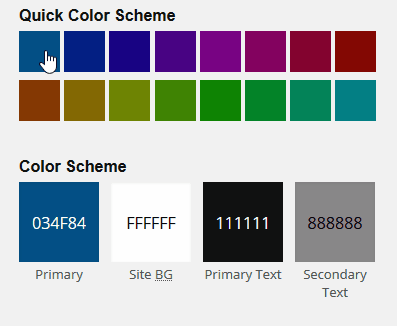 Like the Pearsonified Skin, Flex is equipped with an advanced color algorithm that creates an entire color scheme based on a single color selection.
In addition, Flex comes with a quick color selector you can use to implement one of 16 hand-picked color schemes. And if you don’t see a color you like in the quick selector, you can always choose whatever colors you like by clicking on the big color swatches in the Design options.
The bottom line is that Flex gives you infinite color scheme options. No matter what color(s) you choose, Flex will adapt the design accordingly, and you’ll always end up with a finely-tuned color scheme.
Aside from the smart color tools, Flex comes with everything you need for beautiful typography. Dozens of Google Fonts and the Proxima Nova font are included, and because it leverages Thesis’ typography tools, Flex will always adjust your design to pixel-perfection based on the font you pick.
(No other WordPress Theme can do this. We think this is one of the coolest things about Thesis.)
Built for Speed
We know that big header images are one of the most sought-after features in modern design, and Flex includes really BIG images that will make an impact on your visitors.
Unfortunately, these big images come at a pretty high price—a price that is almost never addressed in other WordPress Themes.
That price? Performance. Big images are the number one performance killer on websites (and poorly-handled scripts are number two…more on that in a moment). And it gets worse—mobile visitors are the hardest hit by performance problems associated with your design.
But where other Themes fail, Flex excels. Thanks to an included image algorithm, Flex optimizes your images for all devices, thereby ensuring maximum speed for your visitors without sacrificing anything in the way of design.
Flex also takes this one step further by optimizing all scripts included in your HTML, regardless of whether or not they are included by the Skin or by Plugins that follow sub-standard coding practices.
In other words, Flex is quite literally a performance enhancer for your website!
Enhanced Author Bio Box
Whether you run a multi-author site or just want to make yourself look as good as possible, you’ll benefit from the snazzy author box included at the bottom of the Single template.
You can make author avatars any size you like, and you can even link author names to archive pages for enhanced SEO.
And hey—if author boxes aren’t your thing, there are dozens of other details like this that set Flex apart from the rest.
Customizable Call-to-Action
One of the best ways to get visitors to do what you want is to include a call-to-action on important pages. With customizable call-to-action boxes on the Front Page and Single templates, Flex has the tools you need to tell your audience where to go and what to do!
Check out the call-to-action at the bottom of this demo post [edit: link removed], and you’ll see how useful a feature like this can be. It’s ideal for email signups, product sales, or even just linking the most prominent content on your site. Use it however you want!
Go Social!
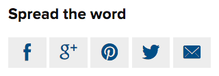 It’s no secret—sharing links to your content on social media is one of the best ways to generate traffic for your site.
To help you with this, Flex automatically includes social sharing links to Twitter, Facebook, Google+, Pinterest, email, and even WhatsApp for mobile users!
(You can turn this functionality off if you like, too.)
WYSIWYG Post Editing
Naturally, Flex makes use of the latest Thesis technology, and one of the coolest aspects of this is the WYSIWYG post editing environment. Whether you’re composing a post or a page, your text will look precisely like it does on your site once it’s published.
If you’ve not yet experienced WYSIWYG post editing with WordPress, you’re really going to love this feature. Many people say there’s no going back from it!
Mobile-first Design
The Flex design is geared toward mobile devices, but it looks great on desktop computers, too. With its mobile-first, responsive CSS framework, Flex is easily customizable while still being totally optimized for all your visitors, no matter how they view your site.
Bottom line? Your site never looked so good…or so fast!