A couple of weeks ago, I showed you how simple text emails are more preferred than fancy html emails.
Now, the question is, how wide should you make your simple text newsletter?
Hardcore internet marketers often send a thin email, often no wider than 300 pixels, or 45-50 characters.
I always believed that was too thin, and on Social Triggers, I’ve often sent emails that were 380 pixels wide, or around 65 characters.
However, here on DIYthemes, I decided to run some tests, and here are the preliminary results:
First, Here Was The Setup
On AWeber, my personal favorite email provider, they make it extremely easy to run a split-test broadcast.
After clicking “create split test broadcast,” you’ll see a screen just like this:
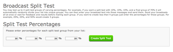
As you can see, I just simply added 25% to each section. Then, when you press create split test, AWeber automatically generates 4 separate emails, each of which goes to 1/4 of a randomly selected portion of the email list.
Cool, right?
Now What Were the Email Split Test Variables?
As I said, I created 4 separate emails, and here’s how I broke each one down.
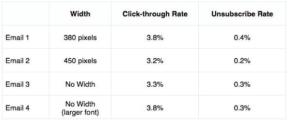
- Email 1: This email was limited to 380 pixels
- Email 2: This email was limited to 450 pixels
- Email 3: This email had no width, meaning the text would expand to the browser window.
And then, for an added test, this last email was a different type of email.
- Email 4: This email had no width, but the font was larger than the other 3 emails.
So, for the purpose of this test, Email 1, Email 2, and Email 3 were competing with each other.
And then, Email 3 and Email 4 were also competing.
Now let’s look at the results.
If you’re wondering how I limit an email to a certain width, I simply add a table into the broadcast section with a specific width. In AWeber, it’s as easy as pressing a button
Preliminary Results: How Wide Should You Make Your Email Newsletter?
So, here’s what happened:
Now, as I said, these are preliminary email split test results.
But as you can see, it appears that no width with a larger font is the best solution.
Let’s break it down…
The first 3 emails were using the same font, and in that scenario, 380 pixels was the best for clicks, by a large margin.
To put that in perspective, on 10,000 emails, Email 1 would generate 380 clicks, whereas Email 2 would only generate 320 clicks, which means the results of Email 1 are ~18% better than email 2.
However, when you look at these test results, you can get the same number of clicks with less unsubscribes by simply using no width + larger font.
Now, I’m not one to complain about unsubscribes. If people are going to unsubscribe, they’re going to unsubscribe. That’s just the way it is.
But that doesn’t mean you shouldn’t seek to minimize them where possible, which is why I like Email 4.
Further Testing Needed
The above test was based on one email broadcast.
And while the sample size was more than adequate, I won’t be happy until I replicate these same results over the course of several different broadcasts.
So, you can bet I’ll be doing that over the coming weeks.
Now, if you want more on email marketing, here are some articles you should check out:
1. Why Email Marketing Crushes Social Media Marketing (and How to Get Started)
2. Here’s How You Can Build Your Email List Fast (Three Articles on Effective Email Marketing)
3. How The Feature Box Increased Our Email Subscription Rate by 51.7%