Curious what will happen to your site when you unleash Thesis + Focus creator Chris Pearson on it?
Obviously, it’s gonna be awesome!
Let’s take a look at precisely how awesome…
AstroBetter.com Website Modernization
This 10-year old website had been running Thesis 1.x forever, and it was in need of some TLC to fix the following issues:
- Old design was not responsive
- Lots of Plugins (21, in fact)—many of which probably weren’t necessary anymore—but the site owner was afraid to remove any of them for fear of breaking something!
- Slow loading times as a result of zero performance optimizations
- Minor detail cleanup, like getting rid of outdated nav links
And here’s what the site looked like on Thesis 1.x:
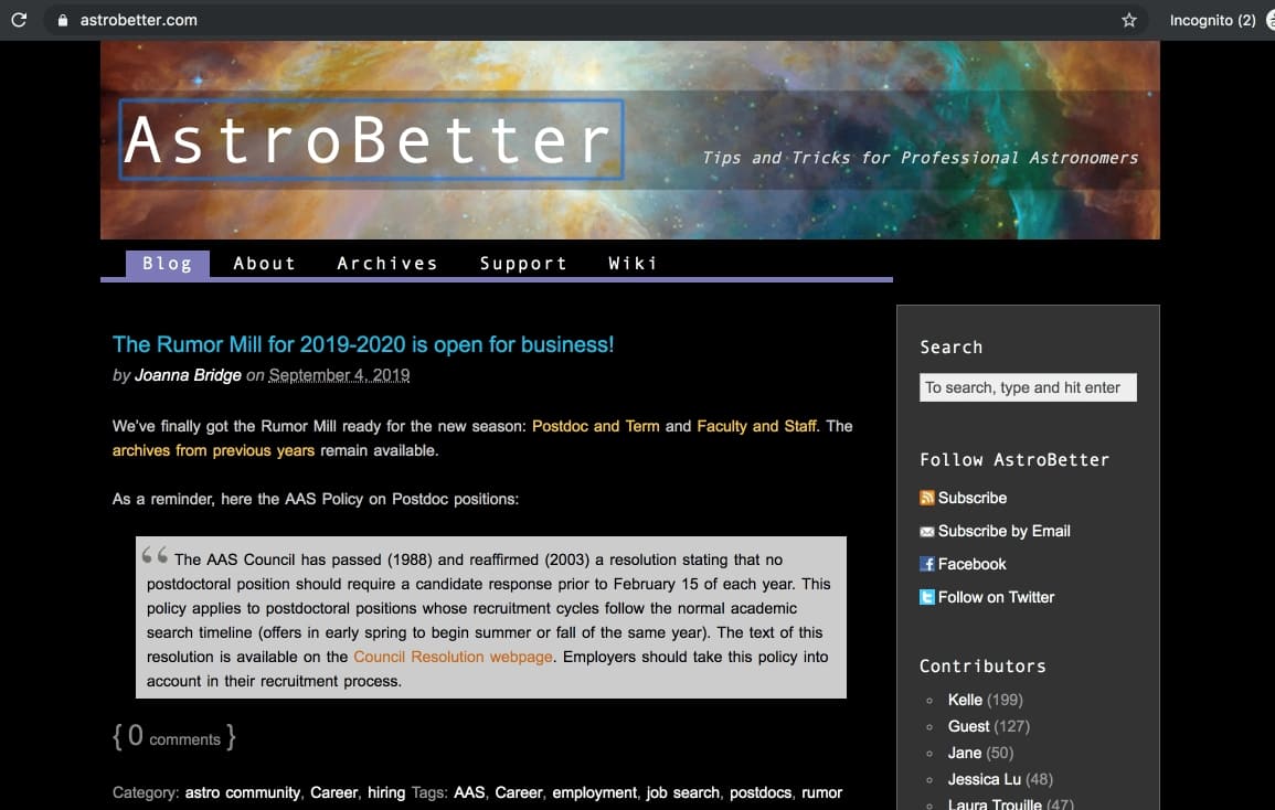
Not pictured: A buncha cluttered junk in the Sidebar!
The design is what it is.
But I’m much more interested in how the site works, and on that note, let’s check out the performance of the old site:
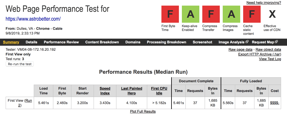
Load time: 5.461s, Requests: 37, Page size: 1.685MB…yuck!
Armed with this information, I was ready to give AstroBetter.com the proper Focus treatment.
Step 1: Install Focus and Clean Up Some Basic Messes
In an upgrade/modernization process like this, the thing most people tend to be concerned about is preserving their old design. But there’s a problem here…
If all you care about is the design, you’ll be willing to commit an untold number of performance sins to get the result you want.
And then you’ll end up with a painfully slow website that’s difficult to customize and maintain.
No, thanks.
With AstroBetter.com, the only real “design asset” from the old site was the header image—a killer nebula image from deep space! (In other words, nothing else was critical or worth saving for the new design.)
After I installed Focus, I wanted to do two things to honor the original design:
- Incorporate the nebula header image in a way that jives with the Focus layout
- Use the old header font to provide some brand-specific character throughout the new design
In other words, I wanted to re-imagine the AstroBetter.com design in a Focus context, and I was going to use 2 items from the old design to do it.
Why do it this way? This approach provides me with more freedom to preserve performance and also to deliver a customization environment that is easy to work with and easy to maintain.
Since your website is actually the experience of running your website (and not your design), this is a big win for the site owner!
Anyway, while fiddling with the new Focus-based design, I also performed some basic optimizations:
- Installed the Clean Up WP Box to remove emoji and Gutenberg crap
- Started using the native Thesis Google Analytics implementation
- Re-cut and optimized the nebula header image
- Optimized the Favicon
- Reduced the number of Plugins from 21 to 7
- Optimized the delivery of Plugin assets (CSS + JS)
At this point, here’s what AstroBetter.com looked like on Focus:
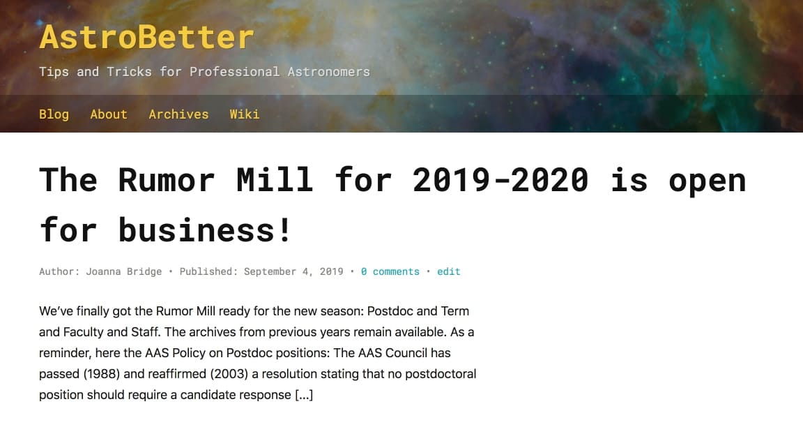
Responsive! Looks awesome! Cool fonts! More speed! Easier to customize!
And the following speed test reveals a nice improvement in overall site performance:
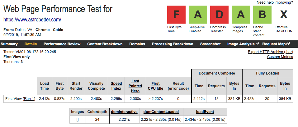
Load time: 2.412s, Requests: 18, Page size: 381kB
Significantly better! But not yet good enough for me. Here’s why:
AstroBetter.com is pretty much just a simple blog that doesn’t contain any “heavy” functionality like ecommerce or even email forms. As such, there’s no good reason why its pages should take longer than about ~1.5 seconds to load, even on a basic shared server.
Step 2: Ruthless Optimization
Determined to produce a result I could be truly happy with, I dove back in and made a couple server-level tweaks to add gzip compression and expires headers (nerdy stuff that improves performance).
I also added some light caching, which is perfect for sites like this.
With these optimizations in place, AstroBetter.com is fulfilling its potential as a screaming-fast website that loads in ONE SECOND:
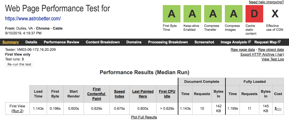
Load time: 1.143s, Requests: 10, Page size: 142kB
This is what it looks like when Chris Pearson gives your site the Focus treatment.
Don’t you think it’s time to unleash him on your site?