The Focus Design Options are divided into two parts—base options and deployed options.
You’ll find base options in the top 3 sections of the Focus Design Options:
- Base Fonts
- Base Colors and Styles
- Base Layout Dimensions
And you’ll find deployed options in the bottom 3 sections:
- Layout Sections
- Site Elements
- Content Elements
The purpose of this document is to provide insight into which elements in the deployed options will be affected when you change base options.
Important note: The accuracy of the information presented here is dependent upon whether you’ve modified the deployed options.
Base Fonts
The Base Fonts settings inform Golden Ratio Typography calculations in Focus, and the results of these calculations affect all sizing and spacing in your design.
Primary Font Size
The primary font size plays a key role in determining values that appear in numerous locations in the deployed options: font size, padding, margin, and various spacing dropdown selectors.
All font size selectors in the deployed options include 6 sizes based on a typographic scale derived from the primary font size (with associated Design Options variable references):
- Size 1
$f1(largest size) - Size 2
$f2 - Size 3
$f3 - Size 4
$f4 - Size 5
$f5* (primary font size) - Size 6
$f6(smallest size)
Within the Design Options, you’ll find font size dropdown selectors in the following locations (default setting in parentheses):
- Layout Sections ↓
- Footer (none, defaults to Size 5*)
- Site Elements ↓
- Site Title (Size 1)
- Site Tagline (none, defaults to Size 5*)
- Nav Menus (none, defaults to Size 5*)
- Content Elements ↓
- Bylines (Size 6)
- Blockquotes (none, defaults to Size 5*)
If you’re wondering why there are so few font size selectors in the Design Options, it’s because Focus employs dynamic sizing on key elements for maximum impact in responsive environments.
This is why classical elements like headlines and sub-headlines (h1-h4) do not have font size selectors—they are automatically presented with optimal sizing depending on the viewing device.
When you change the primary font size in Focus, all the sizes shown above (Sizes 1–6) change along with it. This is why all size references are relative (Size 1) rather than absolute (47px).
Changing the primary font size has other significant effects, too—all layout spacing is derived from the line height associated with the primary font size.
In other words, when you change the primary font size, Focus also makes many other spatial adjustments to ensure perfect proportionality in any viewing context.
And similar to font sizes, layout spacing is conveyed through 6 scaled values:
- x1
$x1(largest unit) - x2
$x2* (primary spacing unit) - x3
$x3 - x4
$x4 - x5
$x5 - x6
$x6(smallest unit)
The following dropdown selectors in the Design Options use these spatial values (with default settings in parentheses):
- Base Layout Dimensions ↓
- Horizontal Gutters ↓
- Desktop Gutter Width (x2*)
- Mobile Gutter Width (x3)
- Horizontal Gutters ↓
- Layout Sections ↓
- Header ↓
- Padding Top (x3)
- Padding Bottom (x3)
- Content ↓
- Padding Top (x2*)
- Padding Bottom (x2*)
- Footer ↓
- Padding Top (x3)
- Padding Bottom (x3)
- Header ↓
- Site Elements ↓
- Nav Menus ↓
- Nav Link Top Padding (x4)
- Nav Link Bottom Padding (x4)
- Spacing Between Nav List Items (x2*)
- Inputs ↓
- Text Inputs ↓
- Padding (x5)
- Textarea ↓
- Padding (none, defaults to Text Input padding)
- Select ↓
- Height (none, uses browser default)
- Text Inputs ↓
- Buttons ↓
- Horizontal Padding (x4)
- Vertical Padding (x5)
- Previous/Next Links ↓
- Padding Top (x3)
- Padding Bottom (x3)
- Nav Menus ↓
- Content Elements ↓
- Lists ↓
- Left Margin (x2*)
- List Item Bottom Margin (x4)
- Image Frames and Captions ↓
- Padding (x3)
- Callouts ↓
- Padding (x3)
- Bleeds ↓
- Padding Top (x2*)
- Padding Bottom (x3)
- Margin Top (x1)
- Margin Bottom (x1)
- Code ↓
<pre>(x3)
- Lists ↓
Font 1, Font 2, and Font 3
Focus lets you select up to 3 fonts to include in your design, and then you can deploy these fonts through dropdown selectors in the Design Options or via Custom CSS.
Why only 3 fonts? This strikes a nice balance between design continuity and resource reduction, which preserves both performance and the integrity of your design.
You’ll find font dropdown selectors in the following deployed options (defaults in parentheses):
- Layout Sections ↓
- Footer (none, defaults to Font 1)
- Site Elements ↓
- Site Title (none, defaults to Font 1)
- Site Tagline (none, defaults to Font 1)
- Nav Menus (none, defaults to Font 1)
- Sidebar (none, defaults to Font 1)
- Inputs ↓
- Labels (none, defaults to Font 1)
- Buttons (none, defaults to Font 1)
- Content Elements ↓
- Headlines (none, defaults to Font 1)
- Bylines (none, defaults to Font 1)
- Heading 2 (none, defaults to Font 1)
- Heading 3 (none, defaults to Font 1)
- Heading 4 (none, defaults to Font 1)
- Blockquotes (none, defaults to Font 1)
Recommended Modification: Make Font 2 a Headline Font
In terms of simplicity and speed, using one font—and ideally a system font that’s reliably installed on most viewing devices—is the most efficient approach.
But oftentimes, when we’re looking for a more refined and unique aesthetic, we might use two fonts—one for body copy and another for headlines and sub-headlines.
If this is the approach you’d like to take, then I recommend the following Design Options modifications:
- Make Font 1 your body font
- Make Font 2 your headline font
- In the deployed options…
- Site Elements ↓
- Site Title — Font 2
- Content Elements ↓
- Headlines — Font 2
- Heading 2 — Font 2
- Heading 3 — Font 2
- Heading 4 — Font 2
- Site Elements ↓
Base Colors and Styles
While the Base Fonts settings determine nearly all the sizing and spacing in your design, the Base Colors and Styles settings determine background colors, text colors, and interior borders.
Layout Colors
Layout colors are intended to serve as the primary, non-text colors in your design. In practice, this involves background colors used on particular elements like full-width layout sections (<body>, Header, Nav, Secondary Nav, Content, and Footer) or content callouts.
All background color selectors in the Design Options are populated with generic color references defined here:
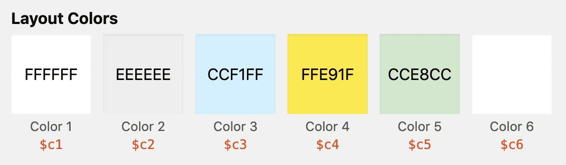
Background color selectors have generic references like “Color 1” and “Color 4;” you can define these colors in the Base Colors and Styles section.
You’ll find background color selectors in the following locations (with defaults in parentheses):
- Layout Sections ↓
- Body (none)
- Header (none)
- Nav (none)
- Secondary Nav (none)
- Content (none)
- Footer (none)
- Site Elements ↓
- Sidebar (Color 2)
- Inputs ↓
- Text Inputs (none)
- Textarea (none)
- Select (none)
- Input Submit (none, defaults to Default Button style below)
- Buttons ↓
- Default (Color 2)
- Save (Custom Color:
#509B26) - Delete (Custom Color:
#D50B0B) - Action (Custom Color:
#12A7FF) - Update (Custom Color:
#FCFC0D)
- Content Elements ↓
- Image Frames and Captions (Color 2)
- Callouts ↓
- Notes (Color 3)
- Alerts (Color 4)
- Boxes (Color 5)
- Inline Highlights (Custom Color:
#FFFB7A) - Code ↓
<pre>(Color 2)
Why is Color 1 not selected anywhere? Browsers default to a white background, so it’s not necessary to declare a white background unless the element you want to have a white background sits atop another element with a different background color.
Text Colors
Text colors are self-explanatory—they determine the text colors used throughout your design. And while there are no rules regarding text colors, there are certainly best practices:
- Use restraint! Keep your text color palette clear, simple, and impactful.
- Make sure your link color is absolutely unique within your design, as this reduces visual confusion and increases the likelihood of positive interactions with your design.
Like layout colors, text color dropdown selectors include generic references—Links, Primary, Accent, and Contrast—whose specific values are defined here:
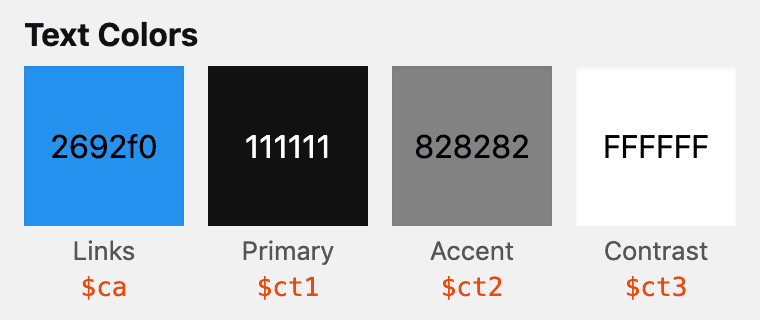
The colors defined here determine the value of relative text color references in the Design Options.
You’ll find text color selectors in the following locations (with defaults in parentheses):
- Layout Sections ↓
- Header (none, defaults to Primary)
- Content (none, defaults to Primary)
- Footer (Accent)
- Site Elements ↓
- Site Title (none, defaults to Primary)
- Site Tagline (Accent)
- Nav Menus ↓
- Link Text Color (none, defaults to Links)
- Sidebar (none, defaults to Primary)
- Inputs ↓
- Labels (none, defaults to Primary)
- Text Inputs (none, defaults to Primary)
- Textarea (none, defaults to Primary)
- Select (none, defaults to Primary)
- Input Submit (none, defaults to Primary)
- Buttons ↓
- Default (Primary)
- Save (Contrast)
- Delete (Contrast)
- Action (Contrast)
- Update (none, defaults to Primary)
- Content Elements ↓
- Headlines (Primary)
- Bylines (Accent)
- Heading 2 (none, defaults to Primary)
- Heading 3 (none, defaults to Primary)
- Heading 4 (none, defaults to Primary)
- Blockquotes (Accent)
- Image Frames and Captions ↓
- Frame Caption Text Color (Accent)
- Standalone Caption Text Color (Accent)
- Callouts ↓
- Notes (none, defaults to Primary)
- Alerts (none, defaults to Primary)
- Boxes (none, defaults to Primary)
- Code ↓
<code>(none, defaults to Primary)<pre>(none, defaults to Primary)
Border Styles
Similar to fonts and colors, border dropdown selectors include generic references whose specific values are defined in the Base Colors and Styles section.
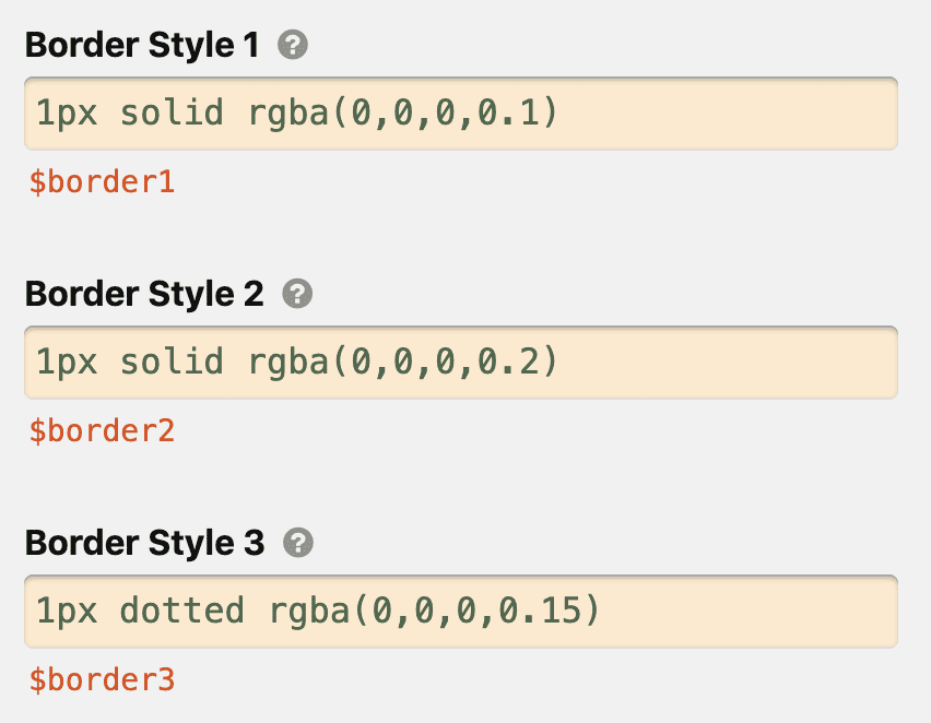
Define Border Style 1, Border Style 2, and Border Style 3 in the base options so you can use ’em in the deployed options.
Here’s where you can find border selectors in the deployed options (with default settings in parentheses):
- Layout Sections ↓
- Header ↓
- Border Below Header (Border Style 1)
- Nav ↓
- Border Below Nav Section (Border Style 1)
- Secondary Nav ↓
- Border Below Secondary Nav Section (Border Style 1)
- Footer ↓
- Border Above Footer (Border Style 1)
- Header ↓
- Site Elements ↓
- Inputs ↓
- Text Inputs (Custom border style:
1px solid rgba(0,0,0,0.2)) - Textarea (Inherit from Text Inputs)
- Select (Inherit from Text Inputs)
- Text Inputs (Custom border style:
- Previous/Next Links ↓
- Border Above Prev/Next Links (Border Style 2)
- Inputs ↓
- Content Elements ↓
- Image Frames and Captions (No border)
- Callouts (No border)
- Code ↓
<pre>(No border)
Recommended Modification: Borderless Layout
Want to remove all layout borders in one savvy move, without having to change a bunch of different options?
Simply delete the border defined in Border Style 1 (in the Base Colors and Styles section), and then click the green Save Design Options button.
Oh, and be sure to hold shift and click refresh when viewing your site after making this change, as this will dump the browser cache and pick up your new CSS.
Wait, it’s that easy? Yep.
Base Layout Dimensions
Unlike fonts, colors, and borders, the base layout dimensions do not have any cascading effects in the deployed options.
The Total Width defines the total usable width of your layout on larger screens, and the Content Width defines the maximum width of a column of text on larger screens.
Finally, the Horizontal Gutters determine how much whitespace appears on the left and right sides of your design on smaller screens.
Because these options do not have cascading effects, you can play around with them without fear of “breaking” your design.
Did you know? The default content width of 644px is precisely calibrated for the default 18px font size. This results in a column of text with a “golden” line height that also yields approximately 80 characters per line—perfect for both short- and long-form reading.