Better than any Page Builder, Focus adds a suite of text formatting tools to the WordPress Editor. Use them to turn a wall of boring content into an engaging visual masterpiece!
The Basics: Headlines, Sub-headlines, and Paragraphs
Focus uses Golden Ratio Typography to provide perfect sizing and spacing
Hopefully, you’re already using sub-headlines—Heading 2 h2, Heading 3 h3, and Heading 4 h4—to break your content into sections that are easier to read and scan.
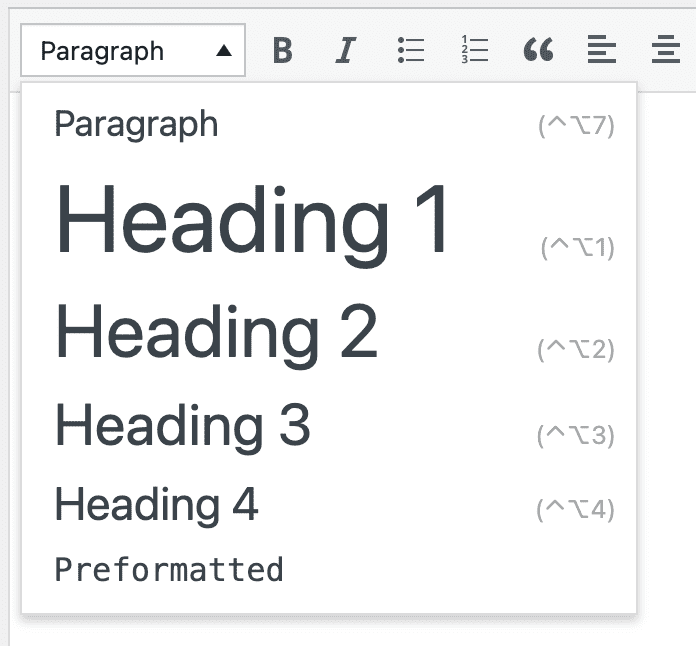
Use the basic formats dropdown in the Visual Editor to change the formatting of your text.
Golden Ratio Typography makes these elements gorgeous, but if you want to create visually exciting pages, you’re going to need some Focus Content Styles!
The Exciting Stuff: Focus Content Styles
Use these Focus Content Styles, and you’ll never need a Page Builder again!
The Focus Content Styles dropdown selector makes it easy to create pages your visitors will love.
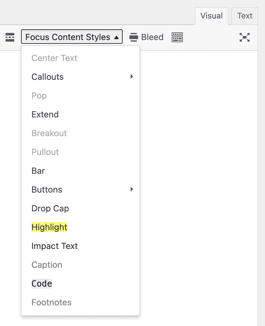
All the formatting power you ever wanted in one place 🔥
Some of the styles dress up your text for more visual impact; some are structural; and others are handy/functional (like buttons).
Master these elements, and you’ll be able to create the most visually-appealing, fastest, and best-converting pages!
Callouts: When you gotta have the reader’s attention!
Callouts are your can’t-miss attention proposition 😤
Got a paragraph you really want your readers to see? You could try incorporating some contextual bolding—making important words or phrases bold—or you could go all the way with these content callouts:
alert— Makes an alert with a background color and padding as defined in the Design Options → Content Elements → Calloutsbox— Makes a content box with a background color and padding as defined in the Design Options → Content Elements → Calloutsnote— Makes a note with a background color and padding as defined in the Design Options → Content Elements → Callouts
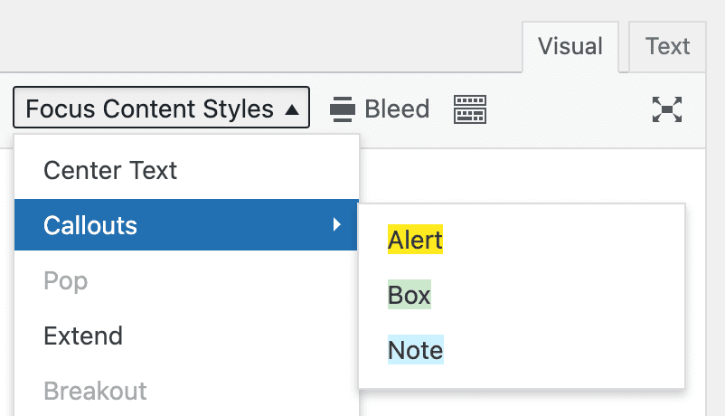
Notice the background color preview in the Callouts menu 🧐
Pro Tip: Callouts can be applied to multiple paragraphs, and they can also include sub-headlines and lists!
P.S. This is a note callout 👆
Structural Styles: When the content column is too limiting!
Use these styles to break out of the content column!
Let’s face it—a single, narrow column of text just isn’t that exciting. You gotta spice up the scroll a bit! Provide users with some visual interruptions as they make their way down the page.
That’s where the structural Focus Content Styles shine:
Prefer the Text Editor? Focus Content Styles can be applied directly to an HTML element as a class:
<p class="extend">...</p>
extend— Force an element to extend outside the content column and take up the full layout width,$w-total, on larger screensbreakout— Break an element out by extending it from halfway into the content column to the edge of the browserpullout— Pull an element out to the side of the content column and extend it to the edge of the browserbar— creates a pseudo sidebar in Readability and Focus Modes (large screens only); in Focus Mode, the bar appears on the right by default but can be moved to the left side by combining this class withleft(ie.<div class="bar left">My bar content</div>)
Bonus! While it’s not quite a structural style, the pop style makes any element look like it’s raised off the page.
pop— Want more impact? Pop it!
Challenge! Scroll around this page and notice how I popped images and certain callouts (like the note above, which is also a pullout).
Buttons: Does your content click for visitors?
Turn any link into a button to increase its visibility and make it irresistible!
Focus includes 5 different button styles to fit every situation you might encounter:
button— Default buttonsave— Save/Yesdelete— Delete/Cancel/Noaction— Action/Goupdate— Update
Only links can be turned into buttons, so be sure to highlight your link first, and then select the button style you want from the Focus Content Styles dropdown selector.
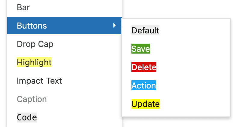
Just like callouts, buttons also have a handy color preview.
Pro Tip: Want to control the font, color, or padding of your buttons? Visit Design Options → Site Elements → Buttons.
One last thing—if you prefer to use the Text Editor, you’ll need to combine button classes to get the results you want:
// default
<a href="whatever" class="button">...</a>
// save
<a href="whatever" class="button save">...</a>
// delete
<a href="whatever" class="button delete">...</a>
// action
<a href="whatever" class="button action">...</a>
// update
<a href="whatever" class="button update">...</a>
Special Text Formatting Elements: Class up the joint!
Put the finishing touches on your content with these attention-grabbing styles
drop_cap— Turn any text into a sophisticated drop capimpact— Turn any paragraph into impact text that has a larger font and automatically spans the usable width of the layouthighlight— Mimics “highlighter” behavior; change highlight color in Design Options → Content Elements → Inline Highlightscaption— Turn any text into a caption; flexible caption behavior enables you to caption images, videos, sub-headlines, callouts, and more! Control the caption color in Design Options → Content Elements → Image Frames and Captions → Standalone Caption Text Colorfootnotes— Turn any text into a footnote; you are responsible for supplying numbered citations via ordered list or superscript
Positioning: Put stuff where you want it!
Use these styles instead of WordPress’ alignment buttons
center— When applied to…- a block-level element, it will center text within that element
- if the block-level element has a pre-defined width, it will center the entire element within its parent
Attention! Centering should only be done using the Center Text item in the Focus Content Styles menu. Using any of the other alignment items will result in inline CSS code on your page, which is considered a violation of web standards.
Additional positioning styles exist, but as of Focus 1.3.1, they can only be applied manually in the Text Editor:
left— floats an element left, clears all floats, and applies a right margin equal to one unit of whitespace$x2right— floats an element right, clears all floats, and applies a left margin equal to one unit of whitespace$x2
For example, if you have an image you’d like to align to the right, you’ll need to switch to the Text Editor and add the following highlighted code to position your image:
<img class="right" src="whatever" ... />
Note: There are also corresponding, WP-specific aliases for the above classes—aligncenter, alignleft, and alignright.
In practice, the WordPress classes get used more often than Focus classes because they appear in automatic WP output (for example, images inside posts). Despite this, I prefer the Focus classes for brevity and clarity.