First time learning about Flex? Be sure to read the original launch post, too.
After we launched the new Flex Skin, you guys had lots of good ideas about how we could enhance the Skin and make it even better. Thanks to your feedback, Flex 1.1 now includes optimized video support, an optional desktop navigation menu, and a more customizable call-to-action area.
Today, we’re going to take a closer look at these new features, and if you’re an existing Flex user, we’re also going to walk you through the process of incorporating these features into your existing site. (If you’re a new Flex user, you can just install the Skin and start winning immediately.)
Let’s dig in!
Enhanced and Optimized Video Support
You asked, and we delivered—Flex now includes an option to include video in the Featured Image area on the home page.
But we didn’t stop there.
Videos are one of the biggest performance killers on the web. If they are simply embedded in a page (which is the most common implementation), they can have a massively negative impact on page load times. Unacceptable.
Instead of loading your video directly, Flex will only load the video when a user clicks on a “play” button the video area. This yields the most desirable result—users see there’s a video they can watch, and your site doesn’t suffer the performance hit of loading a video that likely won’t be viewed by everyone. Quite literally, everybody wins.
In addition, we’ve added a new video button to the WordPress post editor that allows you to place optimized videos in your posts or pages (in the large Featured Image area).
Note: If you’re an existing Flex user, you’ll need to update your Skin’s data to take advantage of this new feature. We will walk you through this process below.
New Desktop Menu
In addition to the hamburger-style mobile menu that shipped with the first version of Flex, we’ve added an optional desktop menu that will display in its entirety if the user’s display is large enough to accommodate it:
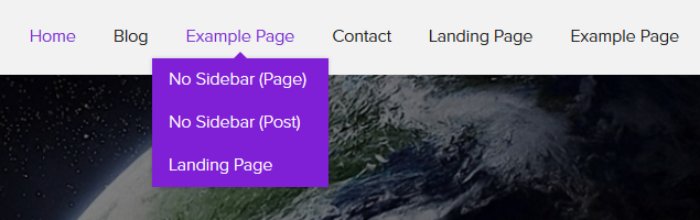
Simple. Useful. Boom.
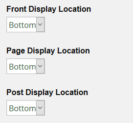
Expanded Call-to-Action Options
In Flex 1.1, you can customize where the call-to-action will display. Each template that includes the call-to-action now has an option to move it from the bottom of the page to the top, where it is more visible.
If you want, you can also suppress the call-to-action on a given post or page by ticking a box in the WordPress post editor. Easy!
Also, for output versatility, HTML is now allowed in the call-to-action title. For more information about this, check out the updated documentation on the Flex call-to-action area.
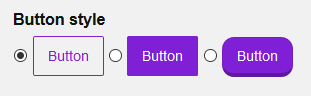
3 Selectable Button Styles
Buttons are important—after all, they are specific elements where users take action on your site. Because of this, it’s nice to have a few button styles to choose from when you go through the process of perfecting your design.
With this in mind, we’ve introduced 3 different, selectable button styles in Flex 1.1. This bit of goodness is located on the Design options page:
Copyright & Attribution: Creative Commons Now Supported!
This one is simple enough—the Copyright & Attribution area now has an option to replace the copyright symbol with the creative commons symbol.
Customizable Notes, Tips, and Alerts
Notes, tips, and alerts are great ways to highlight certain content, and now Flex 1.1 allows you to customize the colors used in these design elements.
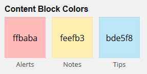
In addition, you can customize the associated fonts by selecting the appropriate option from the drop down menu called Layout Settings, Fine-tune Fonts, and More on the Design options page.
Front Page Featured Image Width Control
Based on your feedback, we learned that some of you wanted control over the width of the Featured Image on the Front Page template. As a result, Flex 1.1 includes an option to limit the width of the Featured Image:
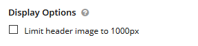
A use-case for this option would be when you have an image that isn’t intended to stretch the full width of the page; for example, a fixed-width image that would look weird if stretched to fill the entire width of the screen.

Note: The actual width of the image in fixed-width mode is determined by the total width of the your content.
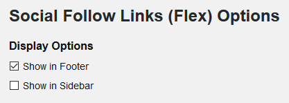
Social Follow Links
The original Flex release included options to add your own social follow links, but you couldn’t control where these links displayed. Now, you can choose to display these links in the sidebar, footer, or both:
“No Sidebar” Templates for Posts and Pages
To give you more precise control over your pages, we’ve split the No Sidebar template into two separate templates—one for posts, and the other for pages.
For a complete list of changes, check out the updated Flex changelog.
Instructions for Existing Flex Users
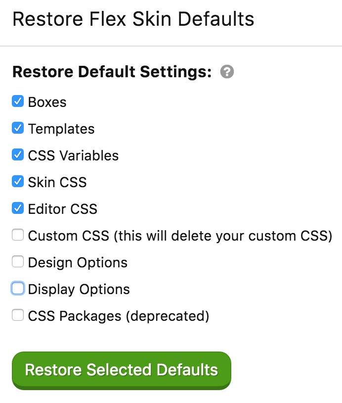
In order to acquire some of the new features in Flex 1.1 (video support, the new desktop menu, expanded call-to-action options, and updated templates), you’ll need to perform a partial data reset.
You need to know: Performing the following partial data reset will overwrite any changes you’ve made to your Flex templates in the Skin Editor. Before resetting Skin data, be sure to create a backup of your Skin in the Data Manager portion of the Skin Editor. This way, you can always recover your work in case things don’t go as planned.
To finish the Flex 1.1 update, you will need to reset your Boxes, Templates, CSS Variables, Skin CSS, and Editor CSS data, as shown in the following image:
To avoid potential confusion, we are providing you with this information before sending out the Flex 1.1 update. We want to make sure you are prepared and understand what you need to do to acquire all the new functionality.