This article is deprecated! Any technical information refers to software versions that are now obsolete. Please visit the DIYthemes Blog for current updates, or check out the old Thesis Blog for a treasure trove of website marketing insights.
Did you know that out of the projected 106.7 million people who will own a smartphone this year, 94% of them will have access to the internet?
Today, people are buying and browsing content on mobile phones more than ever before.
Businesses are stepping up their mobile presence and trying to better engage this massive mobile upsurge.
Large and small businesses alike, there’s simply no ignoring the fact that mobile is a HUGE part of how we do online business. It may even take over completely sooner than we think…
That leads me to ask you this: What have you done to prepare your business for your mobile audience?
A Possible Solution: Responsive Design
Do you know what responsive design is? In a nutshell, it’s a design that will adjust and react to the width of the device it’s being loaded on (with the intention of better serving content to mobile viewers).
While responsive design has some drawbacks in terms of page optimization, it can undoubtedly improve the way your readers experience your site on mobile devices (as opposed to desktop computers or laptops).
That aside, people asked us to make Thesis responsive, and so we did.
The Responsive Skin + Child Theme Starter Set for Thesis (and it’s all yours, free)
Thesis allows you to conquer search engines, load your site fast, and design your own custom skin. Now, you can have a taste of mobile, too.
Ever since Matt released the starter skin and child theme templates, I’ve been working out the best way to make Thesis responsive and look better on mobile devices.
And I think I cracked it 😀
By downloading this skin set, you get the framework for an ideal Thesis skin or child theme (thanks to Matt’s handy work), and you’ll also have a responsive version of Thesis right out of the box!
The best part is, you aren’t limited by the layout you choose. Create 1, 2, or 3 columns, change their widths and flip the column order around…it still stays responsive!
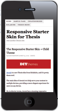
If you want to get an idea, go ahead and check out this demo [edit: link removed] I’ve set up, then start resizing your window (or browse on your smartphone!). You’ll notice that as your browser window gets smaller, the layout of Thesis will start to adapt.
This is the same framework I used to build my latest Thesis skin [edit: link removed], and I’ll be using it on my future Thesis projects, too.
And now you can make it a part of your own projects as well. You can download the starter skin below, or if you develop child themes, scroll down a little to download:

To install the starter skin, be sure to have a fresh install of the latest version of Thesis.
Then via FTP, upload the custom_functions.php and custom.css files you got in the download into your /custom folder located in root/wp-content/themes/thesis_184 (overwriting the old files). Then, re-save your settings in the Thesis options panel, and you’re set!
…or, if you want to develop a child theme, download this:

To install the starter child theme, be sure to have a fresh install of the latest version of Thesis.
Now, login to your WordPress Dashboard and navigate to Appearance → Themes → Upload, then upload the “Responsive-Starter-Child-Theme.zip” file. Then, re-save your settings in the Thesis options panel, and you’re set!