One of the most important aspects of your blog design is your sidebar—after all, it’s on almost all of your pages!
When you’re looking to promote some of your content, you may be tempted to create a fancy image for your sidebar. I know I did…
…But I’ve recently discovered that using an image in your sidebar is a HUGE mistake.
And now I’m going to tell you why.
Let Me Set The Stage…
Here’s the deal:
On my site, I have two separate cornerstone content pieces. One is about building an email list, and the other is about generating more sales.
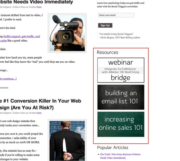
Instead of using simple text links in my sidebar to promote it, I created some graphics to promote them. Here they are:

Overall, it looks pretty good.
But when I looked at my conversion goals, almost none of my traffic hit those pages.
It made no sense to me, so I decided to run some heat map tests using Clicktale.
And that’s when I discovered the major problem with these images.
The Power of Tracking Mouse Movements On Your Website
There’s a few different heat maps available. There’s attention-based heat mapping, mouse movements, mouse clicks, and scroll reach.
I won’t go into detail about these four types of heat maps today, but for this test, I decided to focus on mouse movements.
After all, if you want someone to click on something, their mouse needs to hover over the section that needs to be clicked, right?
Right.
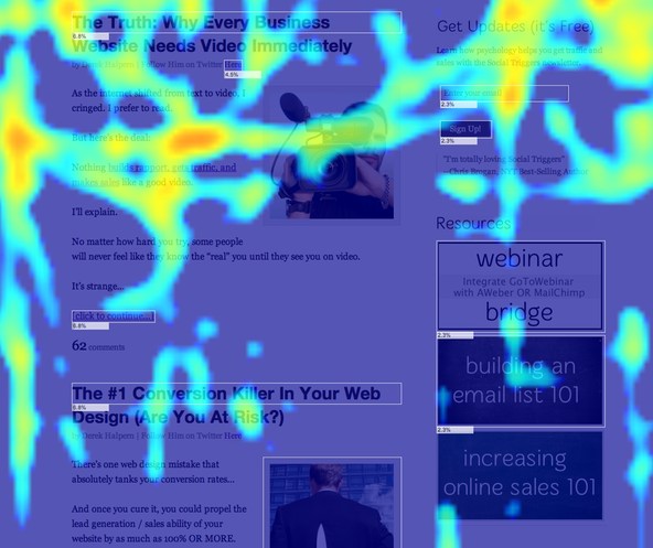
When I ran the mouse movement test, I recorded 455 people and here were my results:

As you can see, the mouse pretty much went everywhere… but over those images.
As a matter of fact, the mouse went NEXT to the images, and then scrolled downwards, which means that people saw the images and decided to ignore them.
Why Did People Ignore Images In My Sidebar?
Heat maps are rarely conclusive because there’s a lot of things that affect mouse movements.
So I decided to take this one step further…
I reached out to a bunch of people and asked them about my resource pages.
And what did they say?
There was an overwhelming amount of people who said “I didn’t realize that those were resource pages. I thought they were advertisements.”
And they’d be right.
One of them was an advertisement, but the other two weren’t.
But the truth became apparent.
Images in sidebars are viewed as ads.
And if you’re using an image to promote some of your great free content, you may be losing out on potential clicks and conversions.
“But Derek, I Want To Use Images. What Can I Do?”
Luckily there’s a solution, and I plan on implementing it real soon.
When you want to use an image to promote some of your content, you must ensure that people don’t view it as an advertisement.
To do that, I encourage you to mention that you’re promoting content in your image.
However, you can also simply include a picture of yourself in the graphic, and I’m betting that will gather a ton of clicks.
(Pictures of people draw attention, and when you’re using your picture, it should gather even more attention.)
Personally, I plan on working some images of myself into my sidebar images and testing the results.
