The heart of the Thesis Options API is a simple PHP array format that Thesis can use to output forms and create options.
An Options API array is basically just a list of options, and you can think of each option in terms of its associated <form> element:
- text inputs
<input type="text" /> - textareas
<textarea> - checkboxes
<input type="checkbox" /> - radio buttons
<input type="radio" /> - dropdown select menus
<select>
The Options API also supports specialized inputs like color pickers, WordPress media gallery selections, and even custom inputs that you define.
In addition, the Options API supports more complex constructions like option groups, option objects, and object sets.
Introduction: Sample Thesis Options API Arrays
Here’s a sample Thesis Options API array for a text input:
array(
	'option_id' => array(
		'type' => 'text',
		'label' => __('Option Label', 'my_namespace'),
		'tooltip' => __('Option tooltip', 'my_namespace')));
In the above code, option_id represents the name of this particular option. This name appears both in the <form> where options are collected and also in your code, when you need to reference the value of an option.
When you build a Thesis extension (be it a Box, Skin, or something else), be sure to give each option a unique option_id.
Next, we have the type parameter, which determines the type of field that will appear in the options <form>. In this case, the option is a text <input>.
In most cases, you’ll want to use the label parameter to provide a label for your option in the output <form>. Also, be sure to include the label value within a translation function as shown above, along with your specific namespace. This will enable your Thesis add-on to be translated into any language under the sun.
Finally, we have the tooltip parameter. If your option requires additional instructions or explanation, providing a tooltip is a great way to convey this information to the user. As with the label above, be sure to place your tooltip within a translation function.
Now let’s look at a sample Thesis Options API array for a checkbox input:
array(
	'another_id' => array(
		'type' => 'checkbox',
		'label' => __('Three Checkbox Options', 'my_namespace'),
		'options' => array(
			'one' => __('Label for option 1', 'my_namespace'),
			'two' => __('Label for option 2', 'my_namespace'),
			'three' => __('Label for option 3', 'my_namespace')),
		'default' => array(
			'two' => true)));
In the code above, the sample option has a name of another_id.
Next, you’ll notice that the type parameter has a value of checkbox, making this option a checkbox within your options form.
Unlike the text option in the first example, the checkbox option requires an array of options to represent each of your checkboxes. The sample checkbox option above actually contains 3 checkboxes, and each checkbox is represented by a ('name' => __('checkbox label text', 'my_namespace')) key-value pair.
Sometimes, you may want your checkboxes to be checked by default, and you can achieve this by providing a default array. In this example, checkbox two has been set to true and will be checked by default.
Now that you’ve seen how Thesis Options API arrays work, let’s look at the basic option types and the various parameters available to each.
Text Inputs
When you need to gather text data from the user, a text <input> is your option of choice (unless you need to collect a lot of text, in which case a <textarea> is more appropriate). The Thesis Options API supports the following parameters and associated values for text inputs:
type—textwidth—tiny(50px),short(120px),medium(200px),long(400px), orfull(100%)code— set totrueif the user should input codelabel— translation functiontooltip— translation functiondefault— default value for this text boxcounter— translation functiondescription— translation functionplaceholder— string or translation function, depending on expected input
Only the type parameter is required for a valid text input, but we strongly recommend you include a label and, if necessary, a tooltip to explain your option.
The counter and description fields are directionally exclusive—the presence of a counter will preclude the presence of a description. Both parameters accept translation functions as their values, and you can treat both of these like input descriptions or prompts for the user.
Also, the placeholder parameter represents an HTML5 placeholder attribute, which can be helpful as a prompt for the user.
Translation functions: Some option explanations reference the use of a translation function. Whenever you include a string, you should wrap it in a translation function like this:
__('My Text', 'my_namespace')
Textareas
If you need to gather a long string of text from the user, then you’ll want to use a <textarea> instead of a standard text <input>.
type—textarearows— integer value for the number of visible rows in the textareacode— set totrueif the user should input codelabel— translation functiontooltip— translation functiondefault— default value for this textareacounter— translation functiondescription— translation function
Once again, only the type parameter is required for a valid <textarea>, but you’ll probably want to include a label and tooltip, too.
Use the rows parameter to determine the number of rows of text the <textarea> displays. For example, if you know you need approximately two lines of input from the user, then you’d want to set your rows to 2.
Checkboxes
For options that can only exist in an on/off state, checkboxes are a perfect choice for simplicity and reliability.
type—checkboxlabel— label above this group of checkboxes (translation function)tooltip— translation function, requires a labeloptions— array of options with'name' => __('checkbox label text', 'my_namespace')pairsdefault— array of checkbox option defaults, set'name' => truefor any options that should be set to true
Both the type and options parameters are required for a valid checkbox <input>.
If your boxes should be un-checked by default, you should omit the default parameter entirely.
Note: Checkbox options and default parameters should be given as array values.
Referencing Checkbox Option Values in Your Code
Unlike most option values, which are stored in basic scalar format, checkbox values are stored in an array.
Because of this, you must use a slightly different syntax when referencing checkbox options. For example, if your checkbox option looks like this:
'eggs' => array(
	'type' => 'checkbox',
	'label' => __('How do you like your eggs?', 'my_namespace'),
	'options' => array(
		'easy' => __('over easy', 'my_namespace'),
		'sunny' => __('sunny side up', 'my_namespace'),
		'poached' => __('poached', 'my_namespace')));
…then your option value references will look something like this:
if (!empty($options['eggs']['easy']))
	echo "You like your eggs over easy.";
if (!empty($options['eggs']['sunny']))
	echo "You like your eggs sunny side up.";
if (!empty($options['eggs']['poached']))
	echo "You like your eggs poached.";
Here, the eggs checkbox structure actually consists of 3 checkboxes: easy, sunny, and poached.
Because of this hierarchical organization, checkbox options require array references instead of scalar ones.
Radio Buttons
When the user must select a single value from a small list of options (5 or less), you should use a radio button. For selections from larger groups of options, consider using a <select> element instead.
type—radiolabel— label above radio options (translation function)tooltip— translation function, requires a labeloptions— array of options with'value' => __('radio button text', 'my_namespace')pairsdefault— default value from the options list
Both the type and options parameters are required for a valid radio button <input>.
In all likelihood, you’ll probably also want to include label and tooltip parameters to further refine your radio button.
Note: The options parameter for a radio button is an array, but the default parameter is just a single value.
Select Elements
If the user needs to make a selection from a large list of options, you should employ a <select> element to simplify their experience. Here’s how it’s done with the Thesis Options API:
type—selectlabel— translation functiontooltip— translation functionoptions— array of options with'value' => __('select option text', 'my_namespace')pairsdefault— default value from the options list
A valid <select> element only requires type and options parameters, but just like the radio button, you’ll probably also want to include a label and tooltip to indicate what is being selected.
Note: The options parameter for a <select> element is an array, but the default parameter is just a single value.
Multiple select? At this time, multiple <select> elements are not supported.
Option Dependencies
To simplify your forms, sometimes you might want to show or hide an element depending on the value of a different input.
To accommodate this scenario, the Thesis Options API contains a simple parent-child dependency system that you can add to any checkbox, radio button, or <select> element.
In the following example, a checkbox determines the display of an associated text input. If the box is checked, then the text input will show. If the box is un-checked, then the text input will be hidden.
array(
	'parent_checkbox' => array(
		'type' => 'checkbox',
		'label' => __('Text Input Controller', 'my_namespace'),
		'options' => array(
			'on' => __('Show the text input', 'my_namespace')),
		'dependents' => array('on')),
	'child_text' => array(
		'type' => 'text',
		'label' => __('Dependent Text Input', 'my_namespace'),
		'parent' => array(
			'parent_checkbox' => 'on')));
To make an option a parent, you must declare which of its options have dependents. In the example above, the parent_checkbox has declared that its on option has dependents.
To make an option a child, or dependent, of another option, you must declare its parent(s). This is done through a parent array, as shown in the child_text option above.
Here, the parent is the on option from parent_checkbox.
Required Options
Some applications may not work without specific data from the user, and in cases like this, it’s nice to be able to mark certain form fields as required.
Accomplishing this with the Thesis Options API is simple, as you only need to add the req parameter to any option, like so:
array(
	'option_id' => array(
		'type' => 'text',
		'label' => __('Option Label', 'my_namespace'),
		'req' => '*',
		'tooltip' => __('Option tooltip', 'my_namespace')));
Notice that the req parameter has a value—* in this example. The value you specify here will appear alongside your option label to indicate that this field is required.
As a convention, Thesis uses an asterisk to mark a required field, but you can use any character you like instead. You can even use a string, but don’t forget to serve it inside a translation function.
Note: You cannot mark a field as required unless you also supply a label.
Option Groups
In some cases, you may wish to group certain options together to organize an interface or make distinctions between sets of options.
This is where option groups come in handy. Check out the following example, which contains two groups of options:
array(
	'group1_id' => array(
		'type' => 'group',
		'label' => __('Group 1', 'my_namespace'),
		'fields' => array(
			'option1_id' => array(
				'type' => 'text',
				'label' => __('Group 1, Option 1', 'my_namespace')),
			'option2_id' => array(
				'type' => 'checkbox',
				'options' => array(
					'yes' => __('Vote Yes on group 1, option 2', 'my_namespace'))))),
	'group2_id' => array(
		'type' => 'group',
		'label' => __('Group 2', 'my_namespace'),
		'fields' => array(
			'option3_id' => array(
				'type' => 'text',
				'label' => __('Group 2, Option 1', 'my_namespace')),
			'option4_id' => array(
				'type' => 'checkbox',
				'options' => array(
					'yes' => __('Vote Yes on group 2, option 2', 'my_namespace'))))));
Grouping options in this manner can be handy for organizing an interface without adding complexity to your option references. Grouped options are still referenced in the same manner as other options, so they are intuitive to work with.
For example, if you’d like to know the value of Group 2, Option 1 (option1_id) from above, you’d use a reference similar to this in your code:
$options['option1_id'];
Ultimately, option groups are a basic, classical way of organizing options within an interface, but they aren’t the only way to achieve better interface organization.
For that, you need option objects, which we’ll look at now.
Option Objects
Similar to option groups, option objects are structures consisting of individual options that are related in some way.
Their purpose is not only to refine and organize an interface, but also to organize options data itself in a meaningful way.
To function properly, an object must have the following 3 parameters:
type—objectlabel— translation functionfields— array of options in Options API array format
Let’s look at some sample code for an option object, and we’ll see how objects differ from option groups:
array(
	'coffee' => array(
		'type' => 'object',
		'label' => __('My Coffee', 'my_namespace'),
		'fields' => array(
			'beans' => array(
				'type' => 'text',
				'label' => __('Preferred Coffee Beans', 'my_namespace')),
			'condiments' => array(
				'type' => 'checkbox',
				'label' => __('Cream and/or Sugar?', 'my_namespace'),
				'options' => array(
					'cream' => __('cream', 'my_namespace'),
					'sugar' => __('sugar', 'my_namespace'))))));
Though the object syntax is similar to the group syntax, there are two important differences.
First, all option objects store their data in an array. Given the example shown above, you’d use code similar to the following to reference your object option values:
$option['coffee']['beans'];
$option['coffee']['condiments']['cream'];
$option['coffee']['condiments']['sugar'];
Note: Options contained in the fields parameter of an object cannot be referenced directly—they must be referenced through the containing object, as shown above.
Second, options grouped together in an object will always be presented together in the Thesis interface. At this time, there is only one supported way to include option objects in your code, and that’s via the use of an object set, which we’ll look at now.
Adding Objects to the Thesis Interface with Object Sets
Option objects are designed to dramatically reduce the on-screen real estate needed to present options that are related in some way.
When presented by themselves in an interface, option objects aren’t particularly useful because context is usually necessary to understand what certain options do.
To address this issue of context, the Thesis Options API contains object sets. Object sets are groups of objects tied together into a single, robust interface.
Here are the option parameters for an object set:
type—object_setlabel— (optional) translation function, label above<select>elementselect— (optional) translation function,<select>element default textobjects— array of option objects
And here is some sample code for an object set:
array(
	'beverages' => array(
		'type' => 'object_set',
		'label' => __('Drink Preferences', 'my_namespace'),
		'select' => __('Select your beverage type:', 'my_namespace'),
		'objects' => array(
			'coffee' => array(
				'type' => 'object',
				'label' => __('Coffee', 'my_namespace'),
				'fields' => array(
					'beans' => array(
						'type' => 'text',
						'label' => __('Preferred Coffee Beans', 'my_namespace')),
					'condiments' => array(
						'type' => 'checkbox',
						'label' => __('Cream and/or Sugar?', 'my_namespace'),
						'options' => array(
							'cream' => __('cream', 'my_namespace'),
							'sugar' => __('sugar', 'my_namespace'))))),
			'tea' => array(
				'type' => 'object',
				'label' => __('Tea', 'my_namespace'),
				'fields' => array(
					'leaves' => array(
						'type' => 'text',
						'label' => __('Preferred Tea Leaves', 'my_namespace')),
					'condiments' => array(
						'type' => 'checkbox',
						'label' => __('Milk and/or Honey?', 'my_namespace'),
						'options' => array(
							'milk' => __('milk', 'my_namespace'),
							'honey' => __('honey', 'my_namespace')))))));
To see how this structure is advantageous, let’s look at the Classic Responsive Skin design options, which include an object set interface to handle things like layout, fonts, sizes, and colors:
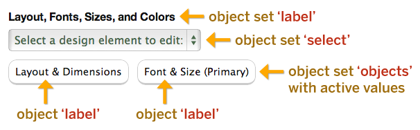
First, object sets are concise—active objects (those with currently-set values) appear as buttons, and inactive objects appear within a <select> element.
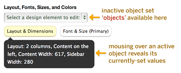
Second, object sets are smart—they know which objects are active (currently contain values) and which are inactive (no values currently set). This provides for some pretty cool interface behaviors, like showing which options are set within a particular object:
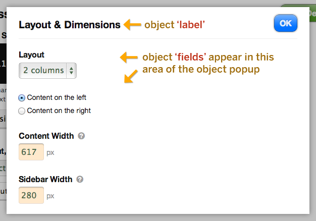
Third, each object in an object set is isolated from the rest of the interface. This reduces visual noise, makes relationships between options clearer, and improves the overall feedback for the user:
In summary, object sets are a new way to present deep customization options to users without overwhelming them with too many options at any given time.
Options Module Syntax
Certain options structures in Thesis require a module wrapper around a typical options array. Two examples of this are Box post meta and Box template options, both of which have interfaces that lend themselves to the module syntax.
For example, in the edit post interface, post meta modules look like this:
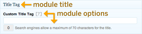
And here’s what a template options module looks like in the Thesis template editor:
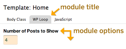
In cases like these where the options module syntax applies, you must specify both a module title and a list of options that appear inside the module. Here’s what that looks like:
array(
	'title' => __('Your Module Title', 'your_namespace'),
	'fields' => array()); /* normal options array */
In addition to the title and fields parameters shown above, some options structures may allow for other parameters in the options module.
For example, template options accommodate an exclude parameter that you can use to prevent options from appearing on certain templates. The WP Loop Box uses this parameter to prevent the “Number of Posts Per Page” option from appearing on Single and Page templates (and their descendants).