In 2015, Google announced it would be increasing its use of mobile-friendliness as a rankings signal.
This is big news, but it isn’t really surprising, as the web has been heading in a more mobile direction for quite a few years. Responsive design has been the rage for a long time, and all of our Thesis Skins feature responsive designs that look great on every device.
But just having a responsive design doesn’t make your site mobile-friendly. Because mobile internet connections are, on average, much slower than broadband signals, site performance is every bit as important as having a responsive design…perhaps moreso!
Everyone is making a big deal about responsive design right now, but did you know that Google has been using site performance as a rankings signal since February of 2010?
This is where most WordPress Themes and responsive designs fall woefully short: Design is easy to see; performance is a bit more nebulous and is affected by many factors.
At DIYthemes, we like to sweat the details, and we love performance. This is why we’ve created the new Effectus Skin, which brings you a customizable responsive design with a huge helping of world-class performance enhancements.
The MOST Customizable Responsive Design
With the Effectus Skin, you can choose from 1, 2, and 3-column layouts, and you can orient those columns in any way you like (3-column with content in the middle, for example). Of course, you can also make these columns any width you want.
I could go on and on about the design flexibility here, but I think the following examples illustrate this more effectively than I can:
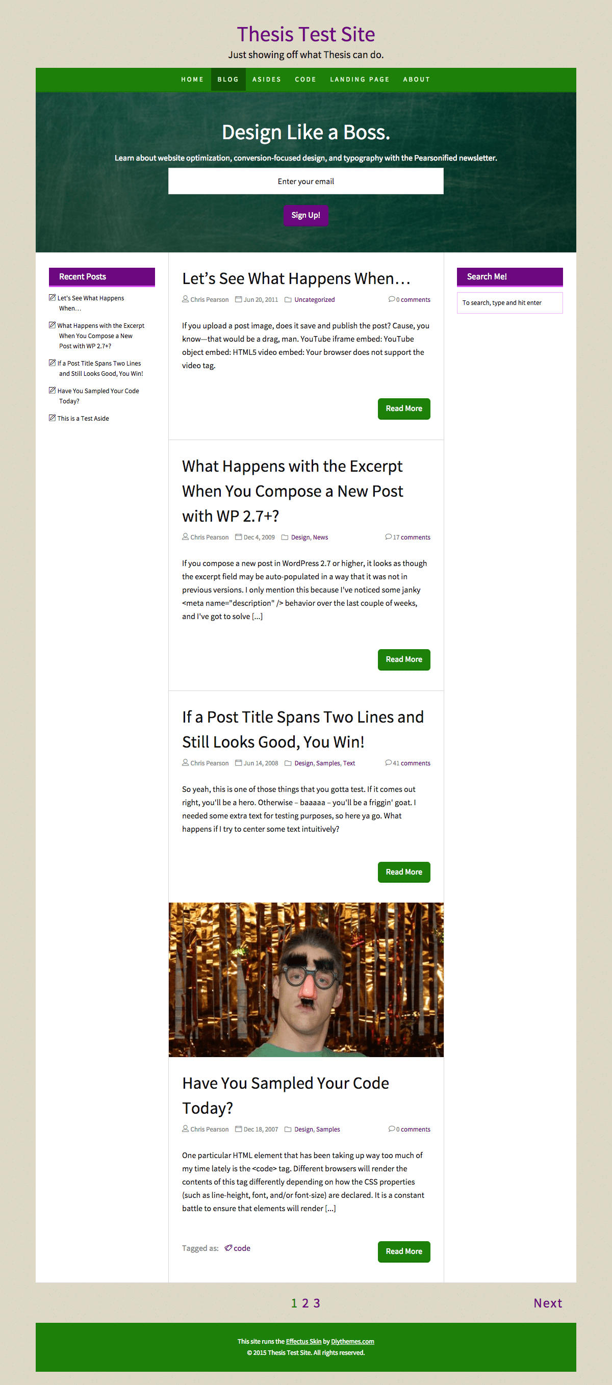
- 3 columns, fixed width layout, content in the middle
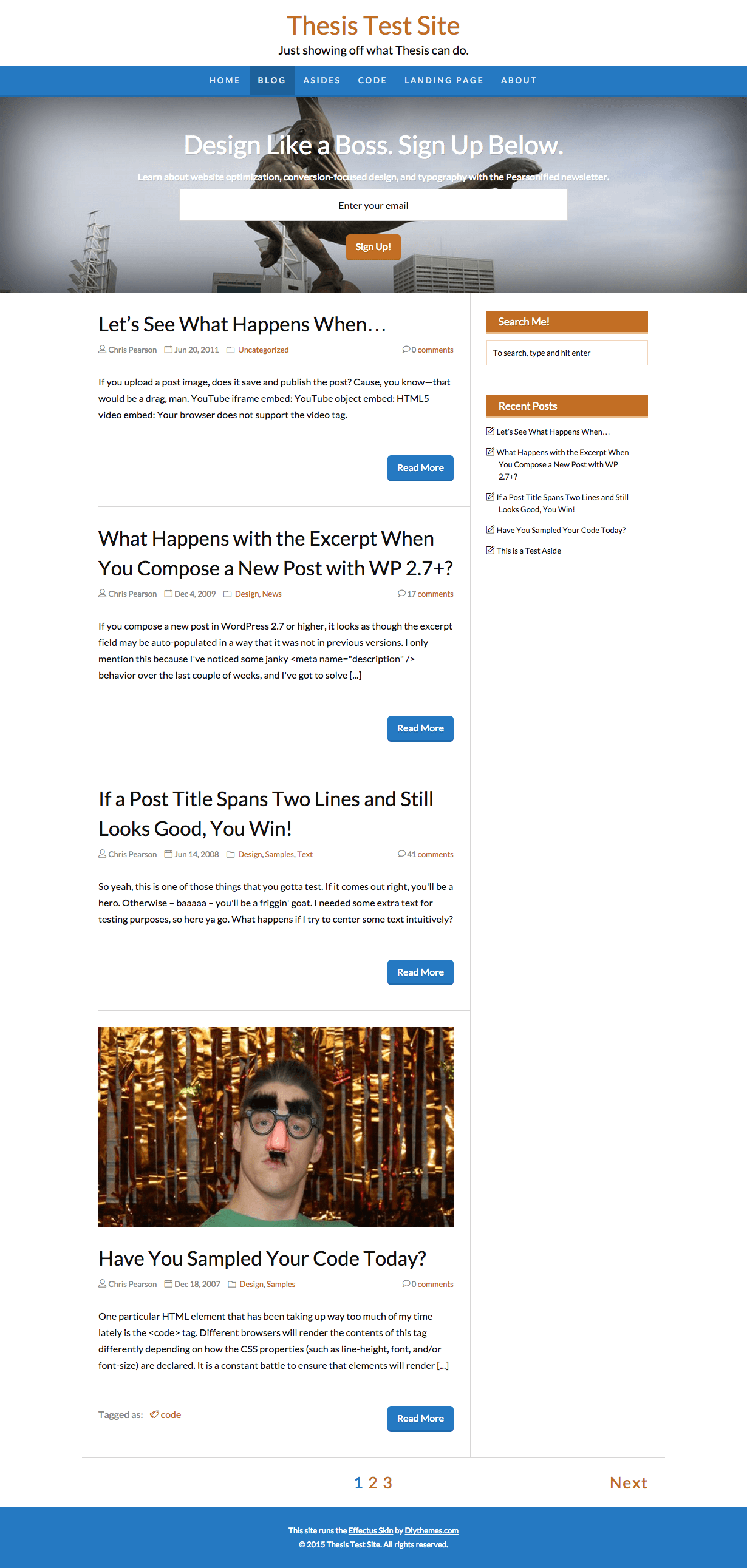
- 2 columns, full width layout, content left
- 1 column, full width layout, “colorless” nav before header, no footer
I made each of the examples above in about 2 minutes by using only the Design options in Effectus. And it’s not just about the layouts, either—you can control fonts, colors, and even the big images that appear in the Action Box at the top of the page from the comfort of your WordPress dashboard.
Speaking of the Action Box…
Action Box for Opt-ins, Sales Leads, or Just Showing Off!
Did you notice the big email opt-in form atop the sample designs linked above? That’s the Action Box, a totally customizable area that is sure to grab your visitors’ attention.
Whether you’re looking for a serious email opt-in area or simply trying to point your visitors in a specific direction, the Action Box is ready to be whatever you want it to be.
You can place images, video, or anything else you want in the Action Box. Once you’ve done that, you can precisely control the look of your Action Box by using the built-in Design options to do things like add background images or change colors, which I did in the examples linked above.
Google Fonts, but without the Performance Hit
Plenty of WordPress Themes include access to Google Fonts, but have you ever run one of these things through the Google PageSpeed or GTmetrix performance analyzer?
The results are…shocking, to say the least.
Nobody wants to give up the customization flexibility fonts provide, but man—that performance hit is a serious bummer.
I’m happy to report that we’ve solved this problem with Effectus.
The Effectus Skin features an asynchronous implementation of Google Fonts, which is a nerdy way of saying that Google Fonts won’t slow down your page loads or cause a damaging performance hit in your metrics.
So go nuts—pick any font you want, and rest assured that your site is still fast and optimized for your ever-growing mobile audience.
Oh, and Effectus will help protect your search engine rankings, too, as Google continues down the path of favoring optimized performance over just about everything else.
Custom Post Editor Buttons for Enhanced Style
Creating stylish and interesting content has never been easier than it is with the Effectus Skin.
In addition to a new appearance that more accurately reflects how your posts will look once they’re published, your WordPress post editor now includes special content buttons as well.
Figure 1. You can use the Effectus post editor buttons to create drop caps, notes, alerts, tips, content boxes, and even blocks of code.
Not familiar with notes, alerts, tips, or content boxes? I think you’ll dig ’em—see what they look like below:
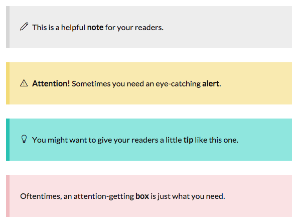
Figure 2. Notes, alerts, tips, and content boxes in the Effectus Skin.
Responsive Design Done Right
Not all responsive designs are created equal. In fact, there’s a built-in paradox with mobile responsive design that makes it much more difficult than just, “Make this design appropriate for mobile devices.”
The issue? Performance. Sites need to be slimmer and faster on mobile devices, but responsive CSS is much bulkier than “classical” CSS, which results in longer loading times. This is strike one.
In addition, it’s become fashionable to make responsive menus and other elements operate with JavaScript—specifically, jQuery—and these fancy treatments require more resources and take longer to load than simpler approaches. Strike two.
Finally, mobile-responsive CSS isn’t even sufficient to handle everything you might put on your site. For example, typical YouTube and Vimeo video embeds, while technically responsive, appear both small and unsightly, especially on mobile devices in portrait orientation. Strike three.
Effectus includes thoughtful solutions to each of the issues described above.
For starters, it’s got a mobile-first stylesheet, which is the leanest and most effective way to write mobile-responsive CSS. You can rest assured that the Skin is loading the minimum amount of resources for your mobile users, and that translates to better site speed all around.
Next, Effectus does not include jQuery or other bulky scripts that unnecessarily weigh down your site for mobile visitors. Wherever possible, we’ve taken a minimalist approach that favors speed and efficiency over flashiness that adds little or nothing (or sometimes even annoyance!) for your visitors.
Third, Effectus contains a bit of automatic magic that ensures your YouTube and Vimeo embeds will look excellent on all devices and in all orientations. I’m not aware of any other WordPress Theme that includes such thoughtful, mobile-centric detail.
The bottom line? With Effectus, we’ve covered an unprecedented number of details, all with the goal of providing you with a responsive design that maintains the highest standards of performance and efficiency.
Explore Effectus Skin Features
You can see the Effectus Skin in action on the Thesis Skin Demo site, but I’d like to provide you with some specific things to look at instead of just sending you over there and telling you to let ‘er rip.
- Notice the Action Box on the demo home page [edit: link removed]
- Check out the default text styling [edit: link removed]
- You’ll enjoy the image styling capabilities, too [edit: link removed]
- Built-in custom templates include Centered Landing Page and Wide Landing Page [edit: links removed]
- Finally, visit the demo to see detailed examples of more Effectus features [edit: link removed]
A Word About Effectus Creator Matthew Horne
Effectus is the first official Thesis Skin from Matthew Horne, who joined the DIYthemes team in January 2015.
Matthew has a keen understanding of the Thesis architecture coupled with a mind focused on optimization and performance, and this combination makes him a world-class Skin creator.
On top of that, he’s completely dedicated to building web design and development products that give you the flexibility you want without sacrificing anything in the performance department.
His efforts shine through in Effectus, and I know you’re going to like working with this fine Skin.
Live Effectus Demo with Thesis Creator Chris Pearson
To see Effectus in action and to learn more about it, check out this webinar.