I’ll admit it… when I design opt-in forms, I’m confident that my form converts well.
It’s simple really. Make a compelling offer, demonstrate social proof, and ask for action, and bam! Instant subscribers.
Well, the other day, I discovered that my system was flawed.
When Opt-In Form Best Practices Fail
Social proof, as coined by Robert Cialdini, is persuasive because people often look to others before pulling the trigger on a decision.
So, when you create an opt-in form, offering up social proof is a best-practice because people assume “other people did it, I might as well too.”
However, when we tested our sidebar opt-in form with split-testing software, we noticed something strange… Social proof hurt our conversion rate.
As far as I knew, Social Proof was a sure-fire persuasion tactic for everything other than romantic desire. I was wrong.
Warning: I’m going to take you behind the scenes of the DIYthemes split-test. The rest of this article is different from what you’re used to reading here on the Thesis Blog, but I’m sure you’ll find it interesting.
The DIYthemes Opt-In Form Split-Test
To test these different forms, I used Visual Website Optimizer split testing software. It’s great split-testing software, and extremely easy to use. Now on to the results.
We used three different variations of our sidebar opt-in form. See them below, and click each one to enlarge:
As you can see, the control (the left), variation 2 (the middle), and variation 1 (the right) are all very similar, but they had markedly different results.
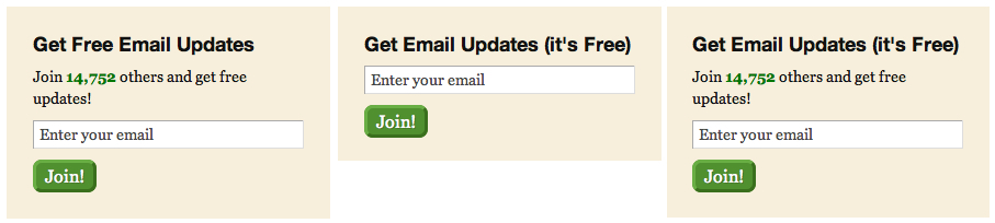
Figure 1: Control, Variation 2, and Variation 1 respectively. Click the image to enlarge.
Before we hop into the data, let me share my thought process behind these small changes.
In both variation 1 and variation 2, I changed “Get Free Email Updates” to “Get Email Updates (it’s Free)” because I figured that including (it’s Free) at the end would make it more visible.
Then, on variation 2, I decided to cut the social proof text completely, whereas on variation 1, I left it in tact.
I should have tested an opt-in form with the social proof below the submit button, instead of above the opt-in form.
The Results of the DIYthemes Opt-In Form Split-Test
As you can see in the chart below, both variation 1 and the control performed rather poorly. However, variation 2 did extremely well.
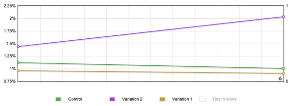
Figure 2: See how Variation 2 improved over time?
When you split-test conversion rates, there’s always that chance that luck played a factor in your test. To prevent that, I tested this with 2,068 visits, and the split was as follows:
- Control – 793
- Variation 1 – 549 (I disabled this early because it performed so poorly)
- Variation 2 – 736
In the end, Visual Website Optimizer predicted that Variation 2 would beat the control 95% of the time, and the final conversion rates were as follows:
- Control – 1%
- Variation 1 – 0.9%
- Variation 2 – 2%
Yes, you’re seeing that right. Removing Social Proof increased the conversion rate of our sidebar opt-in form by 102.2%. (it’s greater than 100% because of a decimal)
Thinks about it… Sure, we may have only increased our conversion rate by 1%. However, when you’re working with hundreds of thousands of visitors, that’s potentially 1,000s of emails.
Why Did Social Proof Fail Here?
That’s a tough question, and I can’t answer that with certainty until I conduct more tests. However, my gut suggests that including a social proof message above the email sign-up form hurts conversions because it interrupts your visitors.
Additionally, the social proof may give readers a reason not to subscribe. Even though our numbers are respectable (almost 15,000), that may not be compelling enough for people.
Going forward, I’m going to conduct another test where I show the social proof below the submit button and see what happens.
What do you think? Why did social proof hurt conversions? Do you have any ideas on what I should test next?