This article is partially deprecated. The custom CSS presented here is outdated; the specific CSS targeting you’ll need for Thesis Skins will vary depending on the Skin.
Your community talks in your comments section. To facilitate this conversation, you want your comments section to be easy-to-follow because it will encourage interaction and loyalty.
“Out of the box,” Thesis Theme gives you the ability to enable threaded comments, which promotes conversation, and provides a slew of other options that let you tweak this area of your blog.
However, what if you want to further customize how your comments are displayed?
Since the structure of the code in the comments section is neatly broken down, there are some simple CSS tricks that will help you enhance your Thesis comments section and keep your discussion flowing.
To help you understand these CSS tricks, let’s take a look at three changes I made to my own blog. Ready? Here we go!
1. Box “Thread” Discussions
Thesis is compatible with WordPress’ threaded comments system (Settings → Discussion), which is great because it keeps conversations flowing.
The problem is, if you get a lot of comments per article, it may be tough to keep up with all of the discussions…mostly because of how cramped text can look.
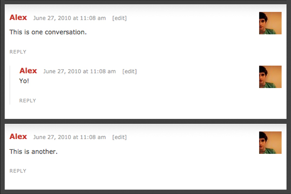
To solve this, I added some CSS to the custom.css file that splits up each comment into their own separate box. With this trick, each conversation will be contained in their own little silo in the comments section.
To show you what I’m talking about, here’s an example:

Figure 1. You can copy/paste the CSS below to create awesome Thesis comment styles like these!
If you want a similar effect to that pictured above, all you need to do is paste these three lines of code in your custom.css file:
.custom #comment_list { background: #000; padding: 1em; }
      .custom #comment_list dd { margin-bottom: 1em; }
      .custom #comment_list .comment { background: #FFF; }
Before we continue, let’s take a look at what this code does:
.custom #comment_list— Adds an outer border color to the entire comments box, and the padding will add space to all sides of this box..custom #comment_list dd— Adds bottom spacing to every comment so they are broken up. Also, I recommend you keep the margin and padding values the same..custom #comment_list .comment— Adds a background color that should contrast with the outer box.
Note, depending on your theme, there may be some additional adjustments needed.
2. Highlight Author Comments
The best way to encourage discussion in your comments section is reply to your readers.
Since you want them to know you replied, it’s a best-practice to make your own comment stand-out from the rest.
Luckily, Thesis makes styling your own comments simple because it automatically detects comments left by the author and assigns a special CSS class that you can edit yourself.
To get started editing, here’s the core code:
.custom dl#comment_list dt.bypostauthor, .custom dl#comment_list dd.bypostauthor>div { background: #FF0000; }
Where do you start?
Well, you can do anything you like. For example, you could add a background image, a border, change the background color, and etc. Here’s an example:

Figure 2. It’s easy to modify your author comments with Thesis’ built-in CSS targeting.
Source: MattFlies [edit: link removed]
3. Style “Reply” Link
 To further increase conversation, you should encourage your readers to reply to each others’ comments.
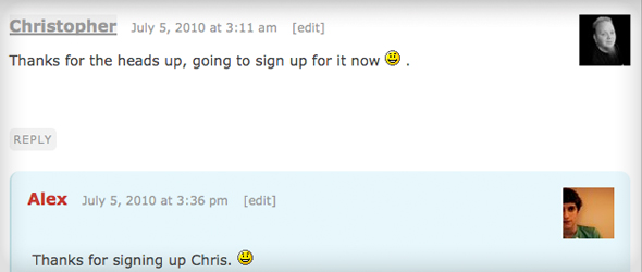
To achieve this, first, you’ll want to enable threaded comments (Settings → Discussion). When you have them enabled, you empower your readers to reply to each other because Thesis automatically adds a Reply link at the bottom of each comment.
The question is, how do you persuade your readers to click reply?
That’s simple…just make your reply link noticeable!
As always, with Thesis, this is easy because there’s a CSS class that allows you to easily stylize your reply link. For example, the code below will add a gray box around your reply link, which will make it pop-out more.
.custom .comment-reply-link {
	background: #EEE;
	padding: 0.4em;
	border-radius: 5px;
}
Basically, what I’ve done is add a background color and some padding. Then, the other two pieces of code will make the box rounded for anyone using Mozilla-based or Webkit-based browsers (Firefox, Chrome, and Safari).
In Conclusion
Thesis gives you the flexibility to customize any aspect of your comments section. Today, I showed you how you can improve the usability and interface of your comments section with 3 simple adjustments that are easy to install and customize.
